How to Plot the Heatmap Charts in Angular?
Workfall
AUGUST 8, 2023
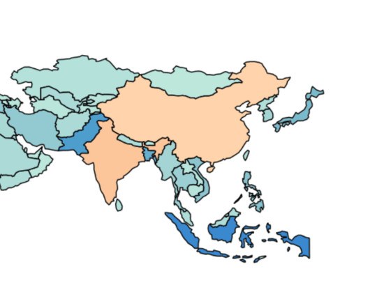
Reading Time: 9 minutes A heatmap chart is a visual representation of data presented in a matrix format. It uses different colors to represent the magnitude of values, making it easy to identify patterns and trends within complex datasets. Warm colors depict higher values, while cooler colors indicate lower ones. This type of chart finds application in diverse fields such as data analysis, biology, finance, and web analytics, offering an efficient means to detect significant data points and corr


Let's personalize your content