


Customizing Apache Superset Dashboards with CSS


Welcome to the rabbit hole…
Contents
Apache Superset has a lot of core product strengths that it offers to different user personae, but at the end of the day, effective dashboard consumption is the key goal of any BI product. In order to make dashboards more meaningful, efficient to interpret, or just more… bespoke, you might find yourself wanting to add a little touch of style. Enterprise BI users might be interested in lending a splash of color or typographic treatment to match their house branding (especially in embedded dashboard applications).
In this post, we’ll cover various approaches to applying CSS to various elements in your Superset dashboards with certain selector techniques, a few frequently requested starting points as examples, and of course a few words of caution.
This post is by no means intended to be comprehensive in nature regarding what you can or can’t do with CSS in Superset. There are countless directions you can take this (some more sensible than others). If you’re not familiar with CSS in general, there are countless tutorials a search (or GPT conversation) away. Some of the CSS examples herein are admittedly a bit hacky. They’re here to whet your appetite, pique your interest, and help get the ball rolling for you.
Superset’s CSS editor allows you to cover a LOT of ground in customizing a dashboard. However, certain risks and “gotchas” make this an almost beta-esque feature, with limited support. We’ll look more closely at those limitations shortly. For now, let’s dig in!
1. Diving in
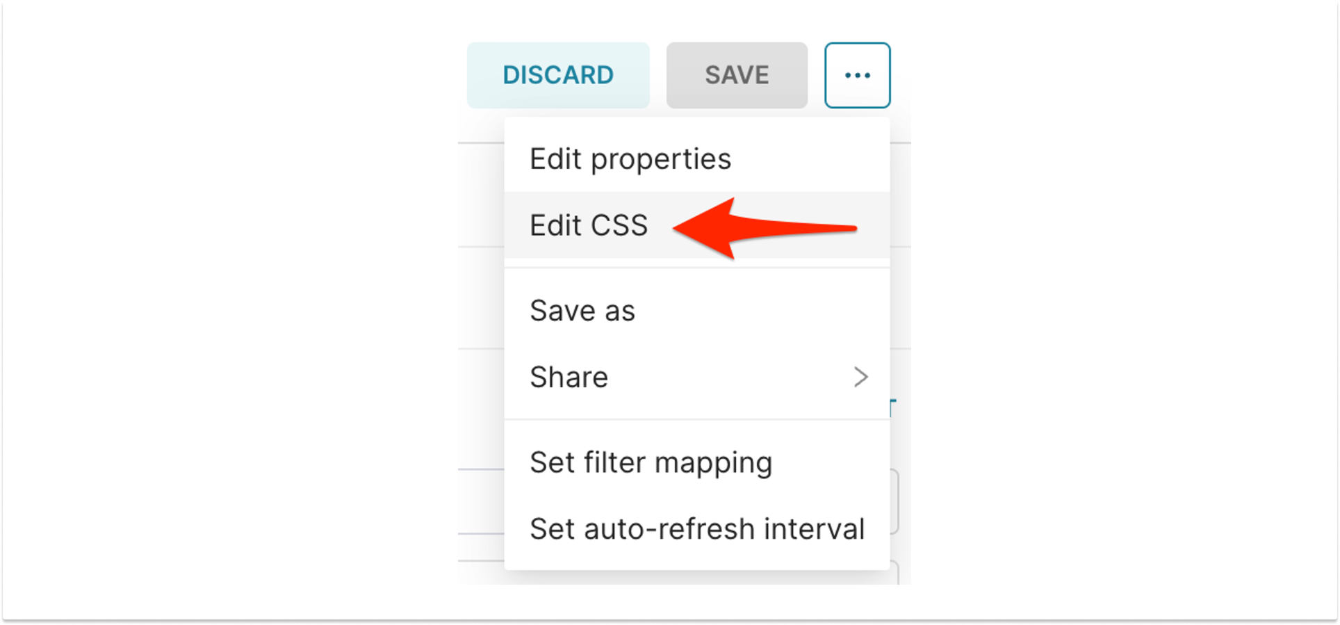
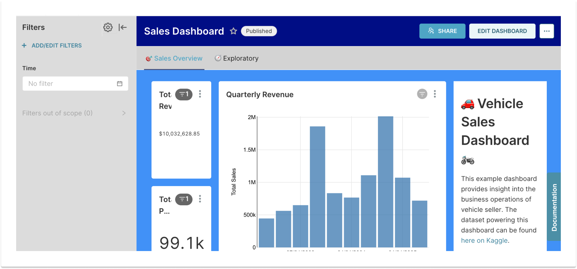
We’ll get to some example use cases shortly, but for now, you might be wondering how to edit a dashboard’s CSS. You’ll be able to access the Dashboard's CSS theme editor by clicking "Edit Dashboard" and then selecting the “Edit CSS” item from the overflow menu with the three dots (note that this menu item is not visible unless you’re actually editing the dashboard).
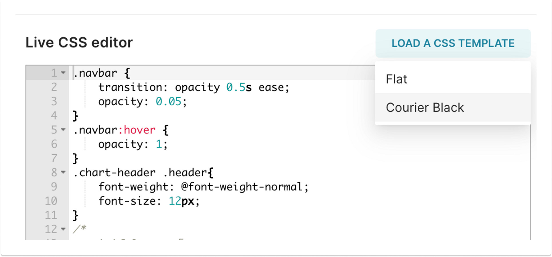
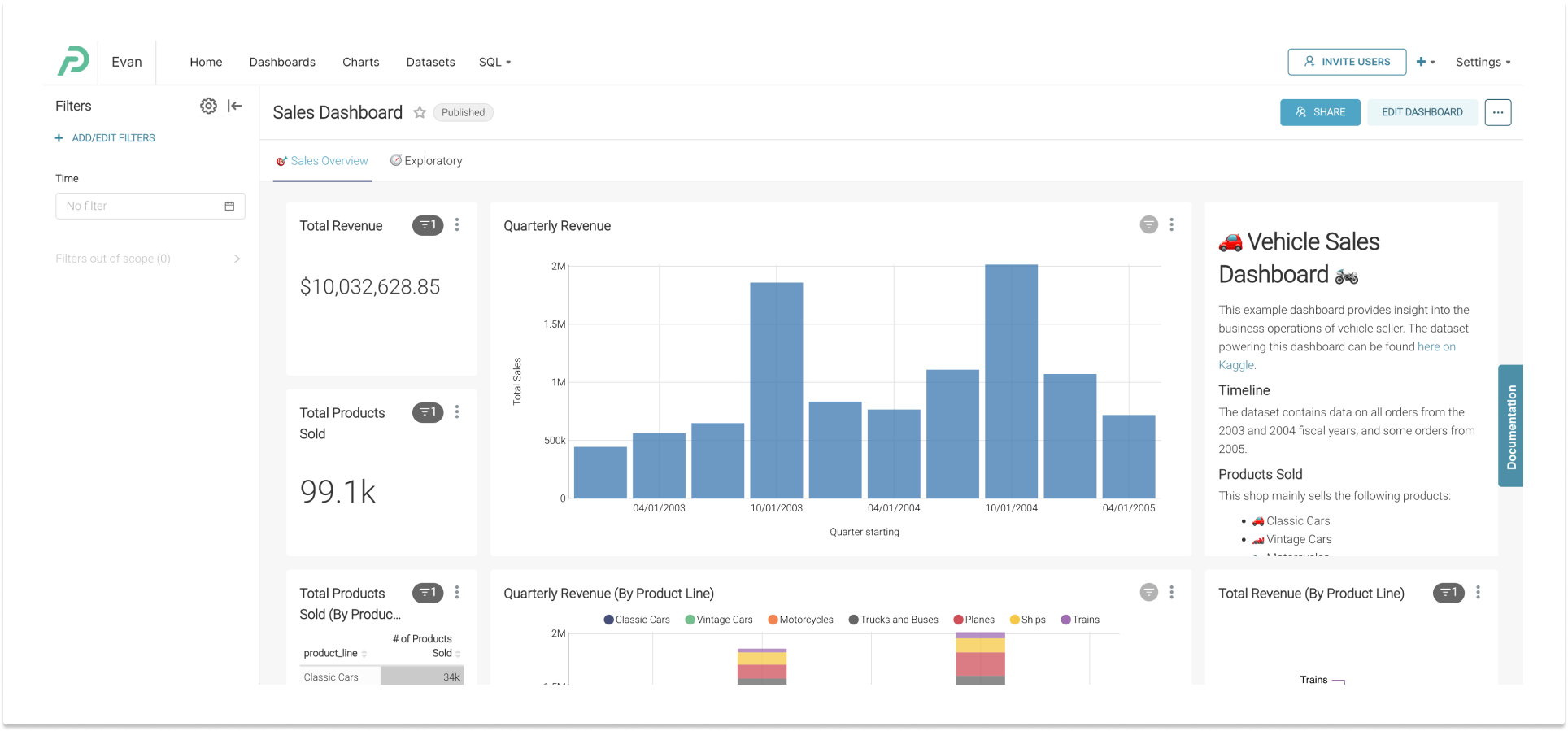
You'll be presented with a full-fledged CSS editor, which also contains a menu in the top right to select from a couple of example templates to give you an idea of how to start tweaking things. These examples are fairly antiquated, acting as a starting point to show you a few things you can tweak. We’ll get to more about these templates (namely, deploying and contributing to them) later.
2. Here be dragons (Important Caveats/Gotchas)
I don’t want to mince words here… you’re entering a world of fragility and edge cases. There are a lot of things you can do, as well as a lot that you can’t or shouldn’t. Here are a few of the things you should be aware of if you’re going to invest your time and energy in custom CSS themes for your Superset dashboards.
- The DOM is not a contract. Superset is constantly undergoing numerous design and code changes, and any of these component migrations/refactors or layout changes may have unexpected effects on the DOM of the dashboard page (and thus your CSS selectors). Be careful to make your stylesheet flexible and maintainable, as certain selectors may not be supported forever, and these changes to the product’s DOM are not considered breaking changes. Use at your own risk!
- CSS templates are global. The CSS template affects more than just the Dashboard itself. It can affect the global navigation and other areas of the page that the dashboard itself sits in (whether in edit mode or not). If you wish to limit the scope of your styling to the dashboard itself, you may want to limit your styles to a selector such as
.dashboard-content > .grid-containerwhich is the dashboard layout itself. - Exceptions DO apply. Many chart types, such as newer ECharts visualizations, as well as a handful of Legacy charts such as DeckGL charts, do not render their artwork with SVG or HTML elements that can be styled, instead leveraging Canvas or WebGL layers. The ability to style some elements such as these may be difficult or impossible.
!importantis sometimes necessary. While it’s usually best to avoid CSS equivalent of the nuclear button (and prefer writing well-targeted selectors and leveraging CSS’s cascade/specificity conventions) — it makes life easier at times like this. Superset has a lot of high-specificity selectors already, and when you want to override a lot of them, your template might be more maintainable if you let this (usually) anti-pattern into your life (in moderation). Be warned: you’ll see some in our examples later!- Use comments. Trust me on this one. Whoever has to circle back to further maintain your CSS file will thank you - even if that is you. Since these files tend to be a wall of overrides, it makes life a lot easier when you know why a style block is there and what it actually does.
3. Some approaches and hints for CSS Selectors
As is true for any website, you have myriad choices at your disposal of how to select various tags, class names, and ids to craft a CSS selector that pinpoints the exact element(s) you want to style. In this section, we’ll cover a couple of approaches to some of the more common tasks.
Selecting/styling specific individual charts
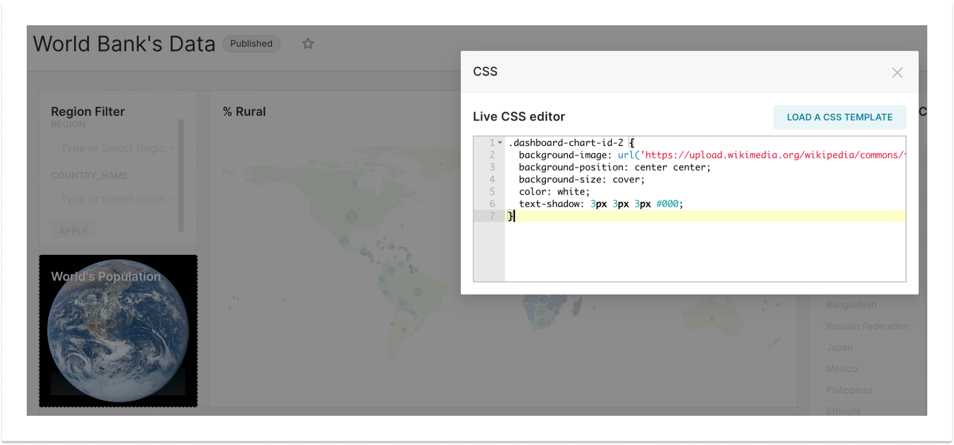
If you want to add custom styles to a particular chart in a dashboard, regardless of dashboard layout (i.e. adding a background image to a Big Number chart), you can add a CSS Selector that references the chart's specific chartID in two ways.
The first chart selector approach is that in each chart’s outer wrapper is a div with a class name in the format dashboard-chart-id-{X} where {x} is the unique identifier for the chart as seen here.
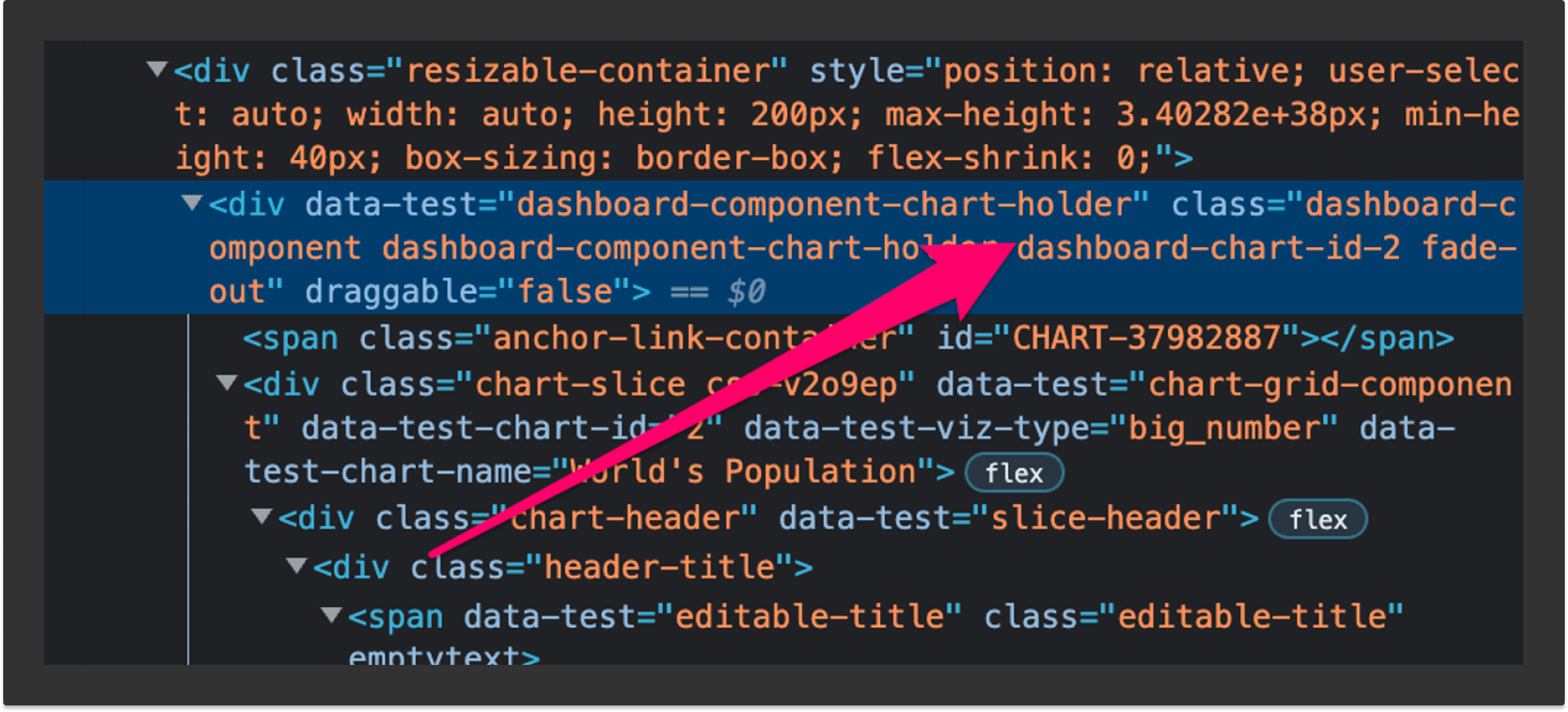
This allows you to more reliably target a particular chart (including the title bar at the top with filter indicator and menu), to do wacky CSS things with it that will affect the whole chart container like so, opening the door to style most aspects of most chart types freely.
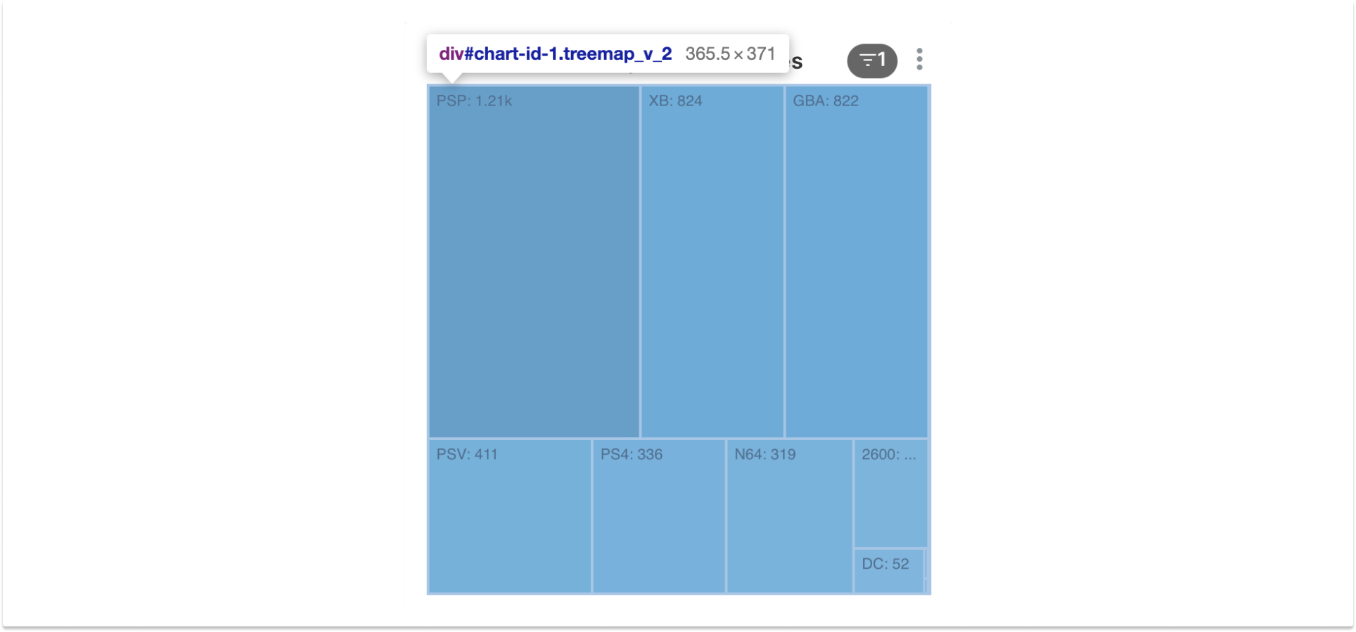
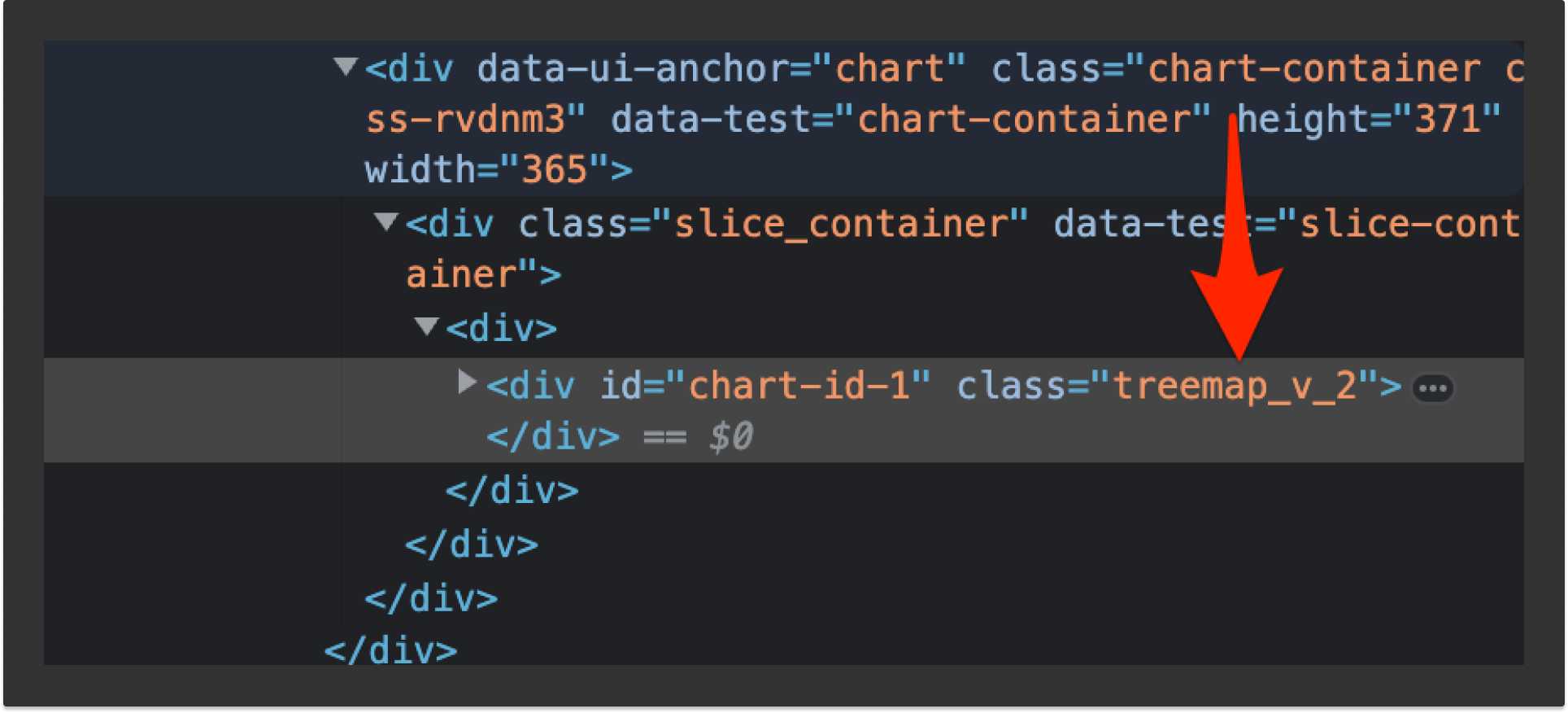
The second approach is targeting each chart’s actual chart area by finding the div tag further down the DOM tree with an id attribute in the format of chart-id-{x}.
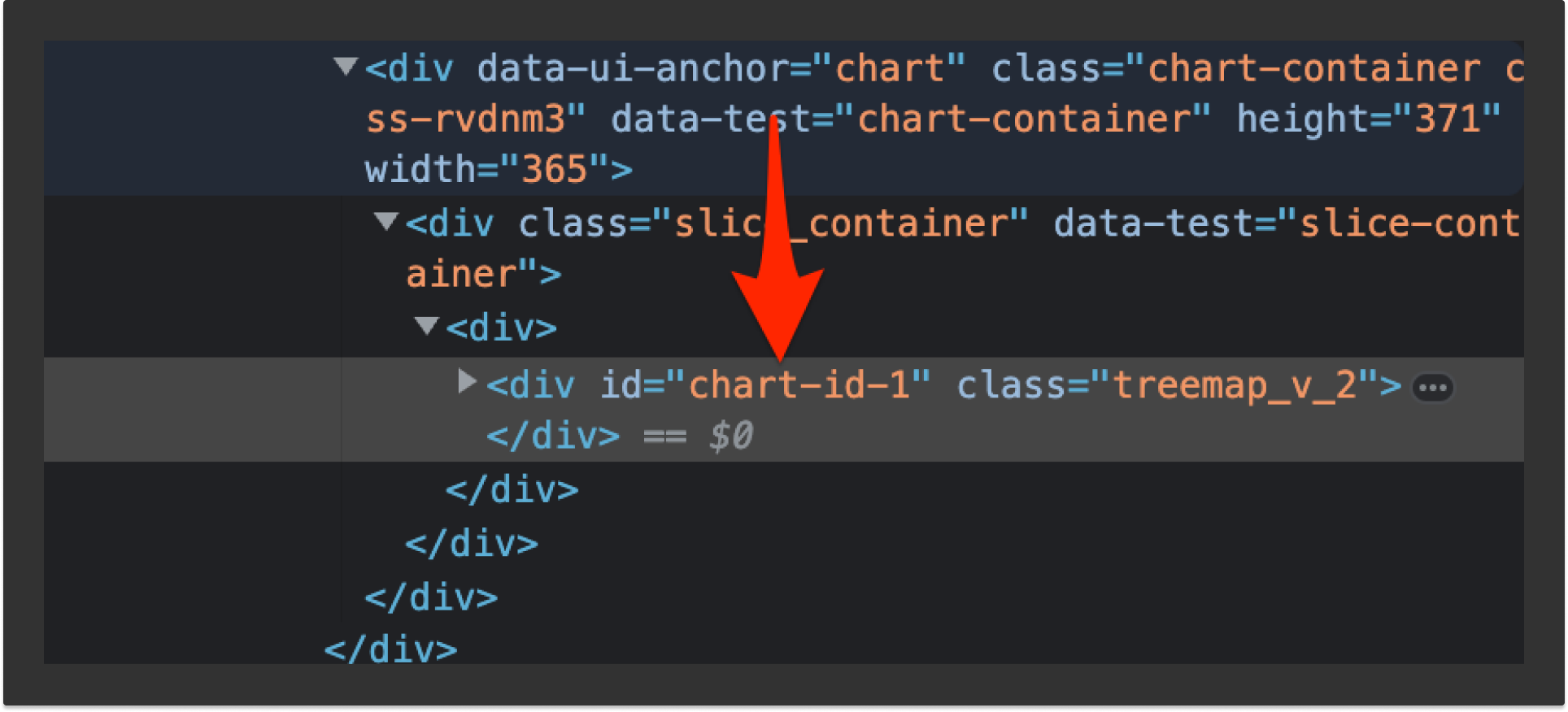
As you can see on hover, this targets the actual chart and does not target the exterior header and related elements surrounding the chart.
Selecting a specific type of chart
If you want to select a specific chart type, and have your styles apply to all charts of that type in your dashboard, you’ll see a class name that you can leverage. Like the previous method utilizing the neighboring id attribute, this also selects the chart area, rather than the entire chart “card” on the dash with the header elements in it.
Selecting the nth chart in a certain area
In certain cases, you may want to add styling to the nth chart (i.e column) in a given row, or perhaps all charts in the nth row, regardless of what that chart may be. For example, you may have a Big Number chart or markdown component in the top-left of your dashboard, and don't care to reference it by ID as in the above example. In cases like this, you may want to use the CSS nth-of-type() selector. You can read up on that selector here for a full explanation of its options.
You'll most likely want to use a selector for dashboard rows, which can be accessed with the dragdroppable-row class, and the columns within those via the dragdroppable-column class. You may want to, for example, select the third chart in the first row of your dashboard, with a selector like this:
.dragdroppable-row:nth-of-type(1) .dragdroppable-column:nth-of-type(3){
    /* do your thing here */
}
It’s important to note that with this approach, things can get look wrong when editing, since any top-level tabs bar becomes a .dragdroppable-row and throws off the row count by 1 compared to the dashboard’s display mode. It might be safer to test your CSS selectors in the dashboard’s display mode using your browser’s CSS editor (dev tools), then copy them over to the CSS Editor when editing the dash. I warned you this can get hacky, right? Check your work early and often.
SVG customization
Many of the charts in Superset (particularly legacy charts, or those using D3) use SVG elements to render their data visualizations. For some of these customizations (e.g. if you’ve made the background of all charts black, and suddenly you need to turn the axes/labels white so you can read them again) you may need to style the SVG paths of a chart. Styling SVG elements is a bit of a world unto its own, and you can get some initial tips about how this works here.
Using data-test attributes
Many times, you’ll find that an element in the DOM doesn’t have a handy class or id added to it. However, you might notice that there are data-test attributes scattered around with handy-looking names attached to them. These are used by our Cypress end to end test suite, and lucky you, they can be leveraged by CSS as well. For example, if you want to target the filters sidebar, you can use a selector like div[data-test=dashboard-filters-panel].
4. Examples
OK, so finally we get to the fun part. Let’s look at some examples! These are just a few things that are commonly requested on Slack threads and Github Issues, and hopefully serve to get the creative juices flowing. If you want to riff on any of these with friends, please join us in #customizing-superset on Slack!
General backgrounds, fonts, and colors
Let’s get a few of the greatest hits out of the way to make broad changes to the aesthetic of your dash.
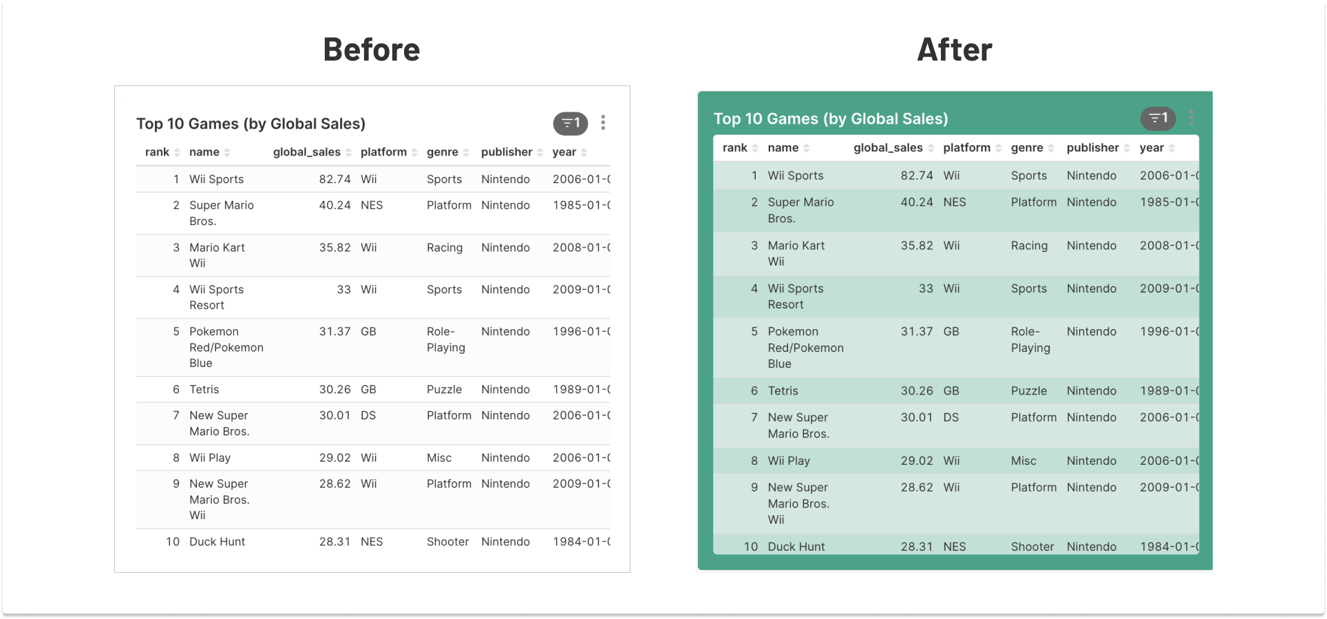
Chart backgrounds
Let’s say you have a single chart you want to make stand out from the rest in your dashboard. In our case, we’ve decided to go with our Preset brand color. Maybe this is a good time to mention that you can use CSS variables, for good maintainability!
  :root {
    --brand-color: rgb(21 165 134);
    --inverted-text-color: #ffffff;
  }

  .grid-content .dragdroppable-row:nth-of-type(3) .dragdroppable-column:nth-of-type(1) .dashboard-component-chart-holder{
      background-color: var(--brand-color);
  }

  .grid-content .dragdroppable-row:nth-of-type(3) .dragdroppable-column:nth-of-type(1) .dashboard-component-chart-holder a{
      color: var(--inverted-text-color) !important;
  }

  .grid-content .dragdroppable-row:nth-of-type(3) .dragdroppable-column:nth-of-type(1) .dashboard-chart {
    background-color: rgb(255,255,255,.66);
    border-radius:4px;
  }
Various backgrounds for main elements
  /* changing the main dash background */
  .dashboard-content{
      background-color: DodgerBlue;
  }

  /* changing the title bar background and text color */
  /* note that the title text looks goofy in edit mode */
  .header-with-actions {
    background-color: DarkBlue;
    color: white;
  }

  /* messing with the header tabs bar */
  /* this is a ridiculous selector... more classes or test attributes could help */
  .dashboard-header-container + div .dashboard-component.dashboard-component-tabs {
    background: LightGray;
  }

  /* changing the filters bar background */
  div[data-test=filter-bar] > div {
    background: Gainsboro;
  }
This isn’t pretty but hopefully serves as an entry point to get to some interesting places.
Fonts
This uses a Google Font just for fun and uses a shotgun of a selector to style everything in the main body that sits in the DOM next to the global nav.
  @import url('https://fonts.googleapis.com/css2?family=Roboto:wght@300&display=swap');

  /* changing the font as globally as possible */
  #main-menu + div *{
      font-family: 'Roboto', sans-serif !important;
  }
Removing UI elements
If you want to give your dashboard a bit of a shave and a haircut by removing some elements from the page, there are numerous things you can do, but here are a few just to get the ball rolling
Removing the dashboard native filters panel
This might be handy in use cases where you do not want users to be able to add/edit filters. There are other means to limit filter use with proper permission configuration, but this will just hide the UI for any and all users regardless of their access level.
  div[data-test=dashboard-filters-panel] {
      display: none;
  }
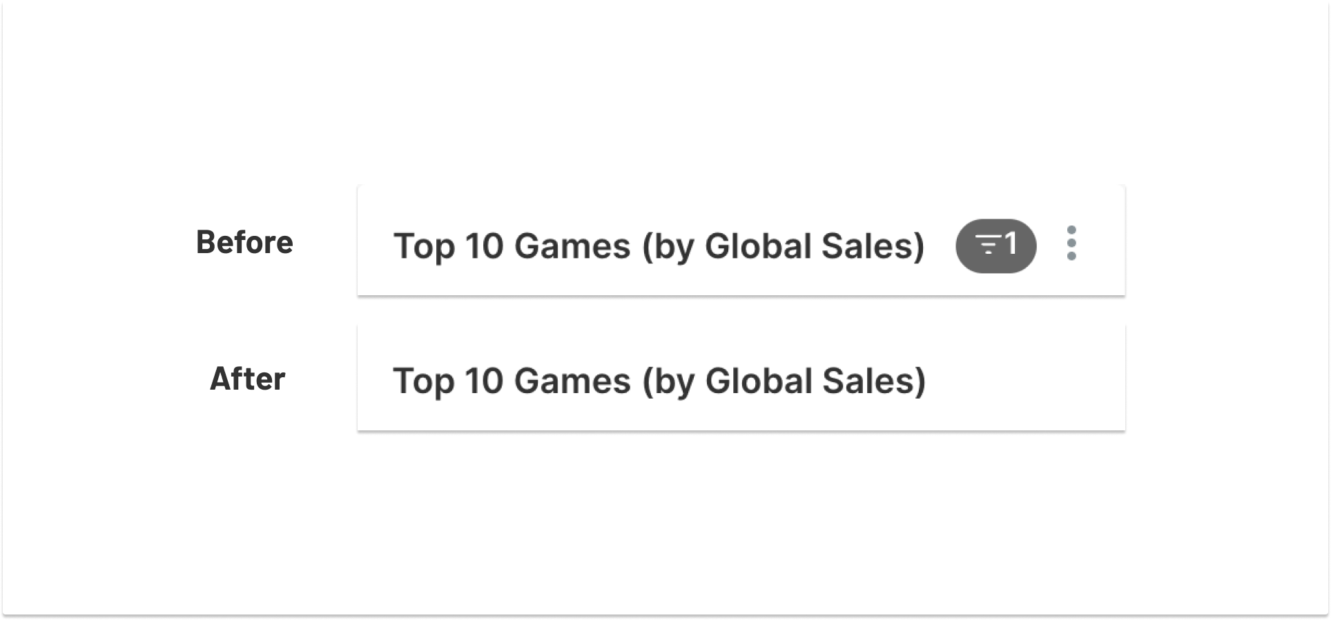
Removing chart filter indicators and/or chart options menu
Note that changes like this do not preclude users from utilizing that functionality. Hiding it is theoretically reversible, and none of the functionality is securely blocked.
  /* this hides BOTH the filter indicator and the chart menu */
  .header-controls {
    display: none !important;
  }

  /* this hides just the chart header menu */
  .header-controls > .ant-dropdown-trigger {
    display: none; /* no !important needed! */
  }
Removing global navigation
This might not be advisable for many use cases, since there are other methods of tackling this (like the “full-screen mode” feature, or proper embedding techniques) but it has been asked for, so here you have it:
    /* remove the global navigation bar */
    #main-menu {
      display: none;
    }
Please note that when making sweeping changes like this, you can get yourself into trouble. For instance, you could remove the title bar and/or the buttons to the right of it to go truly minimal, but if you do so, you won’t be able to edit your own dashboard (including your CSS template) without undoing that styling with your browser’s dev tools. Be careful you don’t compromise user experience for the sake of aesthetics.
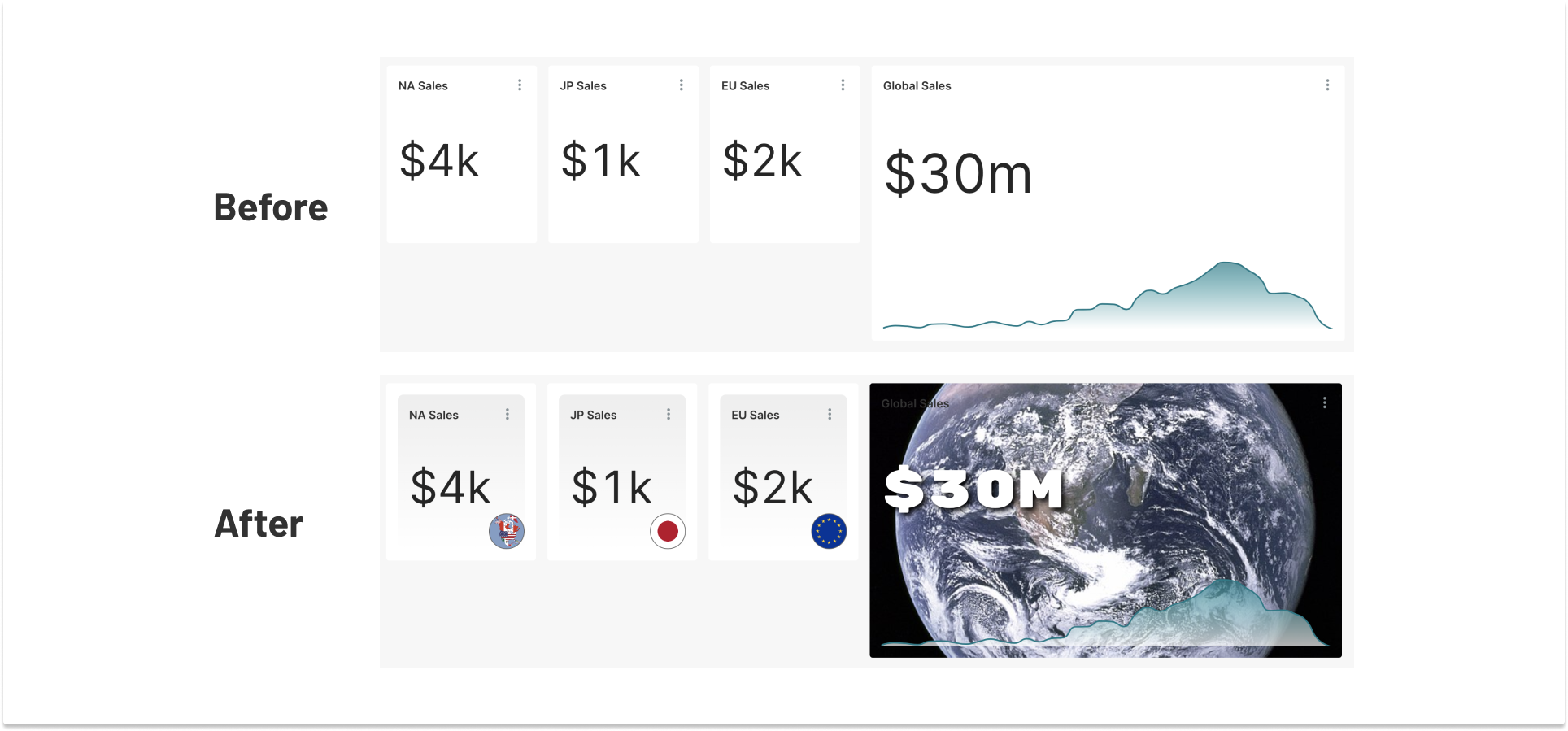
Big Number tweaks
People frequently request custom backgrounds, background colors, font changes, etc for their Big Number charts. Here’s a small sampler of how to achieve some of these mods.
@import url('https://fonts.googleapis.com/css2?family=Rubik+Mono+One&display=swap');

/* setting up some base styles for all three big number charts */
div[data-test-viz-type=big_number_total] {
  background: linear-gradient(#eee, #fff);
  border-radius: 8px;
  padding: 16px;
}
div[data-test-viz-type=big_number_total]::after {
  position:absolute;
  height: 50px;
  width: 50px;
  bottom: 16px;
  right: 16px;
  border: 1px solid #666;
  border-radius:50px;
  content: '';
  background-size: cover;
  background-repeat: no-repeat;
  background-position: center center;
}

/* details for each big number */
.dashboard-chart-id-104 div[data-test-viz-type=big_number_total]::after {
  background-image: url("https://upload.wikimedia.org/wikipedia/commons/e/ee/Flag_Map_of_North_America.png");
}
.dashboard-chart-id-105 div[data-test-viz-type=big_number_total]::after {
  background-image: url("https://upload.wikimedia.org/wikipedia/en/thumb/9/9e/Flag_of_Japan.svg/240px-Flag_of_Japan.svg.png");
}
.dashboard-chart-id-106 div[data-test-viz-type=big_number_total]::after {
  background-image: url("https://upload.wikimedia.org/wikipedia/commons/thumb/b/b7/Flag_of_Europe.svg/510px-Flag_of_Europe.svg.png");
}

 /*having some fun with the big number w/trendline */
.dashboard-chart-id-107 {
  background-image: url('https://upload.wikimedia.org/wikipedia/commons/thumb/9/97/The_Earth_seen_from_Apollo_17.jpg/600px-The_Earth_seen_from_Apollo_17.jpg');
  background-size: cover;
  background-repeat: no-repeat;
  background-position: center center;
  color: white;
}
 /*let's make the big number font heavier */
 /*this will apply to ALL "big number with trend line" charts. */
div[data-test-viz-type=big_number] .text-container {
  font-family: 'Rubik Mono One', sans-serif;
  text-shadow: 4px 4px 8px #000;
}
Fun with Markdown
With the markdown component, you have the ability to add various HTML tags to an element. You can certainly make these as custom as you want. Here’s some example markup that isn’t intended to be pretty — it’s just here to act as a test bed and give you demonstrate that this component is its own little frontier for exploration.
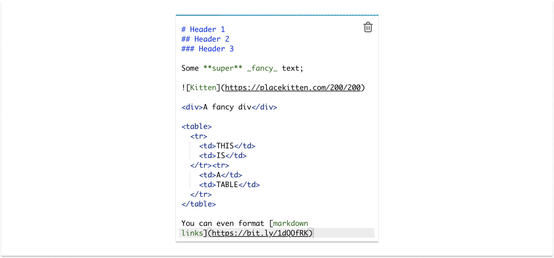
This includes a mix of markdown and HTML for a few reasons. The <div> is there to point out that in Superset’s default configuration, you cannot use class names here, but you can still access it with CSS. The <table> is there because you cannot add Markdown tables, but you can indeed style tables here, which opens up a world of possibilities. The original state of this doesn’t look like much.
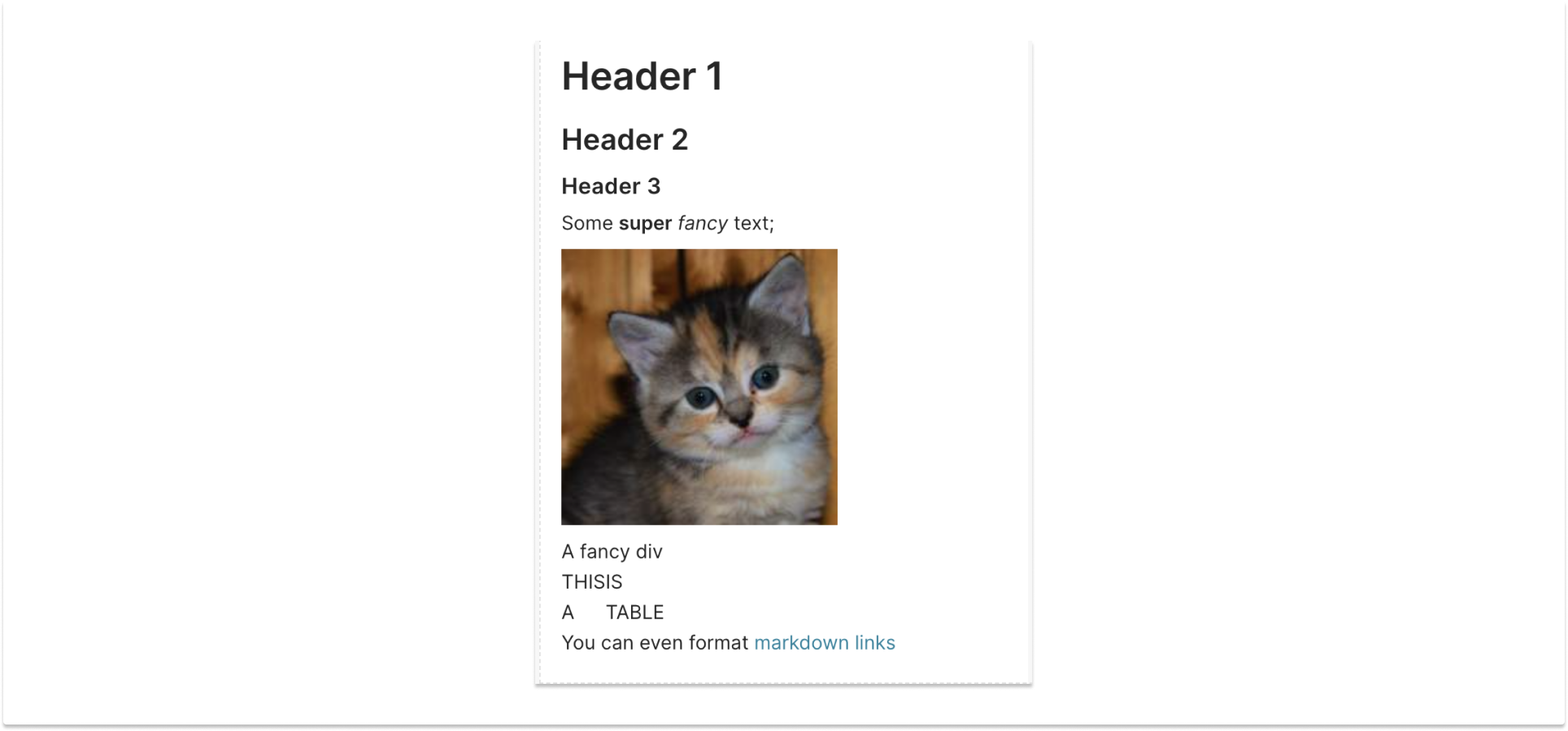
But if we add a quick sprinkling of (in this case pretty arbitrary) CSS, things can get interesting. I hope you can see some possibilities in this madness:
/* you can access markdown styled elements via their html tags */
.dashboard-markdown h1{
  color: red;
}
.dashboard-markdown h2{
  color: blue;
}
.dashboard-markdown h3{
  color: green;
}
.dashboard-markdown p > strong {
  font-size: 150%;
}
.dashboard-markdown p > em {
  display:inline-block;
  transform: rotate(180deg);
}

.dashboard-markdown img{
  border-radius: 50%;
  box-shadow: 5px 5px 10px #666;
  position: absolute;
  top: 10px;
  right:10px;
  transform: scale(.5);
  transform-origin: top right;
}

/* using .dashboard-component here since there are some divs between .dashboard-markdown and the div we want to target. */
/* nth-of-type becomes handy again in case there are more than one intance of the target */
.dashboard-markdown .dashboard-component div:nth-of-type(2) {
  background: pink;
  padding: 10px;
  border-radius: 10px;
  text-align: center;
}

/* fiddling with a table, just because */
.dashboard-markdown table {
  border: 2px solid blue;
  border-radius: 20px;
  text-align: center;
  margin-top: 10px;
}
.dashboard-markdown table td {
  border: 2px solid blue;
  border-radius: 20px;
  text-align: center;
  padding: 10px;
  border: 1px dashed red;
}

.dashboard-markdown p > a {
  font-weight: bold;
  font-size: 21px;
}
Markdown components have all the same selector tricks available to them as any other HTML, so you can get a little clever here. For example, if you have multiple images, you can add alt tags in the markdown (e.g. ) and target it with a selector like img[alt='alt text'].
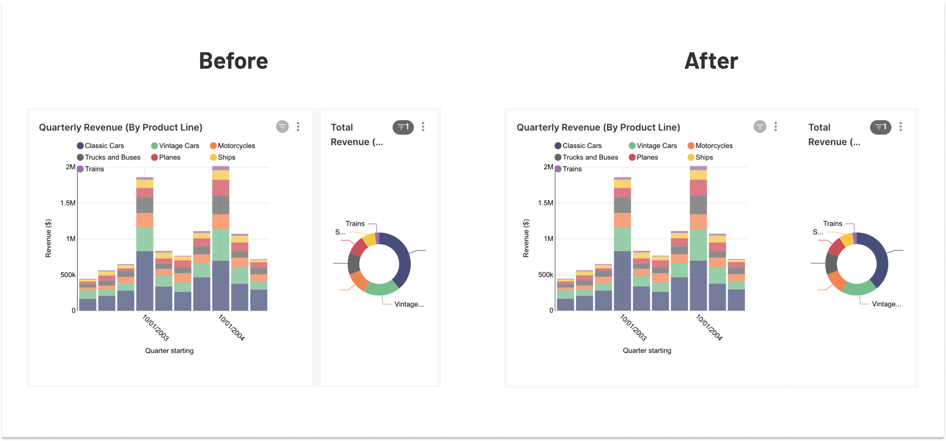
Removing chart gaps so things fit together
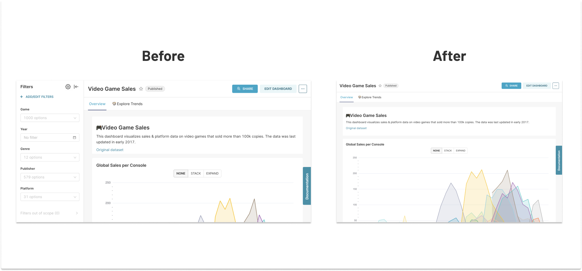
Some people like to have different charts as neighbors in the dashboard, but tie them together contextually by either removing the space between, adding a border, etc. Let’s say we want to take the example Video Game Sales dashboard and visibly tie together the Quarterly Revenue and Total Revenue charts. We’ll target the nth-of-type selectors again since your chart IDs might differ from mine.
/* remove the right margin and right corner radii from the left chart */
.dragdroppable-row:nth-of-type(2) .dragdroppable-column:nth-of-type(2) {
  margin-right: 0;
  border-top-right-radius: 0;
  border-bottom-right-radius: 0;
}
/* remove the left side border radii from the right chart */
.dragdroppable-row:nth-of-type(2) .dragdroppable-column:nth-of-type(3) {
  border-top-left-radius: 0;
  border-bottom-left-radius: 0;
  /* add some space to make up for the removed margin */
  padding-left: 16px;
  /* make the background match .dashboard-component-chart-holder */
  background: white;
}
5. Want to contribute and make things better?
If some of the “hacks” outlined above ruffle your feathers, or you find that there are things that are difficult to pull off in this realm, keep in mind that Superset is, of course, an open-source product! I’d be remiss not to mention at least a few ways for anyone reading this to get involved in making the process of styling Superset dashboards simpler and more fun:
- Add and maintain stock themes. Remember those example themes we started off within the CSS editor? If you happen to build an amazing theme and want to add it to the roster, or if you wish to expand and improve the stock ones, you most certainly can! We’ll review PRs and accept work that adds value for the community following in your footsteps. The stock ones are encoded in a Python file (
/superset/examples/css_templates.py) - Make step 1 easier! Adding or editing those templates is a little cumbersome. We’d be open to proposals or PRs to make these more extensible/expandable, e.g. reading in a directory of (simpler to maintain) template files, rather than parsing the single Python file.
- Adding selectors. Certain bits of Superset’s componentry is not easily accessible, particularly as the project moves away from class-based fewer files, and more into the world of Emotion-based styling. Certain areas (e.g. the dashboard-native filters bar) aren’t easy to style at the moment, requiring some gymnastics around CSS selectors. A few well-placed class names and/or ids could make that a lot more approachable.
- Getting SASS-y. Long selectors are tedious to maintain, so adding a CSS preprocessor that supports nested selectors like SCSS/SASS/LESS/etc. might be a real-time-saver.
If you want to discuss any of these tasks or have other ideas, we’d love to hear more from you in the #improving-superset channel on the Superset Slack workspace.
6. Addressing common requests
But where’s my dark mode?
I’m sorry to say it, but… hold your horses. While this post has covered a lot of what you can do with CSS, there’s still a whole lot of work left to do for proper theming of Superset where you’ll be able to provide some colors/settings that propagate throughout the app. But that’s a subject for another post (or Meetup). Just know that we’ve been steering toward it since the adoption of Emotion styling, and there are plans currently in place to take more steps.
Oh fine, you can’t wait for all that? Well here’s a trivially basic “starter kit” for a riff on dark mode with some non-sanctioned design choices that I whipped up just to show one final CSS demo. Please don’t use this for real… it is not thorough… it’s just a POC for funsies.
.ant-tabs-content-holder{
  background: transparent !important;
}
.ant-tabs-nav {
  background-image: linear-gradient(0deg, #111, #000);
  border-radius: 16px 16px 0 0;
}
.ant-tabs-content-holder * {
  color: #fff !important;
}
.ant-tabs-tab-active *{
  font-weight: bold !important;
}
.dashboard-content{
    background-image: linear-gradient(-45deg, #111, #222);
    font-family: 'Inter', sans-serif;
}
.dashboard-component{
    background-image: linear-gradient(-45deg, #2f2f2f, #202020);
    border-radius: 10px;
    box-shadow: 0 0 20px rgba(0,0,0,.7) !important;
    color: #fff;
}
.dashboard-component-tabs{
  background: transparent;
  box-shadow: none !important;
}

/* these are some SVG styles for legacy charts
.slice_container  svg{
  background-color: transparent !important;
}
text{
  fill: #fff;
}
.nvd3 .nv-axis line {
  stroke: #000000;
}
But what about mobile?
Well… it’s all possible, in theory. This thing’s made 100% out of software. This topic is too big for the scope of this post, but in the meantime, I will say that Superset’s dashboard themes support CSS media queries to handle responsive design, so use those as you see fit. Beyond that, we’ll see what the future holds, but… (teaser alert!) it’s looking slightly promising.
7. Now have some fun!
Get out there and get to tweaking! I hope that this all sets you on a path toward empowerment rather than bewilderment. If I’ve missed any starter point examples that you think the whole world would benefit from, ping me and I’ll try to update these examples.
We can’t wait to see what you get up to with all of this. Please show us what you’ve made #customizing-superset channel on Slack, or on the repo in the Show & Tell discussions. Happy styling!
