Business Analyst infographics are powerful tools for analyzing and consolidating geographic information and—perhaps just as importantly—for presenting that information to others. In addition to running infographics, you can also build infographic templates in the following applications:
- ArcGIS Business Analyst Web App (Advanced license)
- ArcGIS Community Analyst
- ArcGIS Business Analyst Pro

Building infographics is more than juxtaposing variables, maps, and graphics. There is quite a bit of design involved if you want your template to look just right. Some of the most popular data visualizations used in infographics are tables and charts—great when you have lots of data but still want to economize space on the page. This article will walk through design choices related to tables and charts in infographics to offer best practices and considerations.
Tables
Tables make great use of real estate in an infographic: you can display a large quantity of data while keeping the format neat, organized, and legible. Here’s an example of a simple table with variables in the 2020 Census Summary infographic, detailing households by size in a census tract in southeastern Alaska:

There are a few types of tables you can add to infographics:
- Tables with variables—Select variables in the data browser and display the data for your sites.
- Comparison tables—Select variables in the data browser and display the data for your sites, as well as for geographies that you choose.
- Nearby tables—Select a location type (such as businesses or other points of interest) and display the locations near your site.
- Custom tables—If you have your own requirements for a table, you can always create a custom table to fit your specifications.
Whether you’re adding a simple table or designing your own custom creation, there are some best practices for making tables effective in infographics. Let’s dive in!
Size elements correctly
When it comes to making useful tables, the best advice is also the simplest: make them easy to read. It can be tempting to reduce the size of the text so you can squeeze tons of data into a table. Best practice is:
- Font size: 12-point minimum
- Row height: 24-point minimum
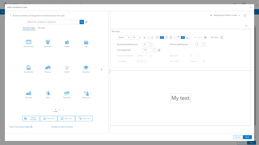
To access table styling capabilities, open the template in the infographic builder, then hover over the table and click Edit.

On the right side of the pane, select the cells you want to modify. You can select an individual cell, or select multiple by clicking the first cell and then holding down Shift as you click the last cell. Once the cells are selected, click the Options button (the little wrench).

The styling pane opens, allowing you to set the text size and row height for the selected cell on the Style cell and Modify table tabs:


When you’re done adjusting the sizing, close out of the styling pane and save your work.
For more best practices regarding text, see Infographic design in Business Analyst: Best practices for text.
Justifying columns
There are no set rules about text justification, but the Business Analyst team often defers to the following guidelines:
- The variable name (usually listed in the left-most column) justified left.
- Numeric data (indicating variable values) justified right.
There is some wiggle room here, and ultimately it’s up to the infographic author. But as an example of how much the text justification can affect readability of your table, here is the same chart—depicting languages spoken in a census tract in Arizona, from the At Risk Population infographic—with the variable name column centered versus justified left.

Row spacing
To make tables more readable, some infographic authors use a blank row to provide extra spacing. Avoid doing this! Blank rows can muck up interactive experiences and cause other issues. Instead, use cell styling to increase the bottom border of a row to a larger thickness to achieve the same effect.
For instance, the table below appears to have a nice blank row after the grey header row:

But in reality, the infographic author has sneakily made the bottom border of the row 14-point thickness using a different color:

Use styles to support theming
There are many advantages to using infographic themes—just read Infographic design in Business Analyst: Best practices for themes to learn why. One way to capitalize on your work designing a theme is to incorporate it into tables.
In the table styling pane, you can select a row and designate it a table header, for example:

You can also use this menu to designate titles, subtitles, and alternating rows.
For more inspiration about the possibilities of tables in infographics, be sure to check out this excellent article series on tabular infographics:
- What are tabular infographics in ArcGIS Business Analyst Web App?
- Build tabular infographics from scratch in ArcGIS Business Analyst Web App
- Explore tabular infographics in ArcGIS Business Analyst Web App
Charts
Business Analyst infographics offer a full array of chart options that will look familiar to users of other Esri products, like ArcGIS Dashboards and ArcGIS Insights. Here’s an example of a simple chart in the Childhood and Female Equity infographic, detailing computer and internet service access in a block group in Boise, Idaho:

While the powerful chart-making tools in infographics are a wonderful thing, the myriad visualization options can also present design dilemmas.
Choose the right type of chart
Any time you’re working with data, choosing the right type of chart for visualizing it is crucial. Will you use a bar chart, line chart, or shape chart? Will you organize your data in series? For a useful primer on general chart-related decision making, read Which chart styles go with which mapping styles? And, for a hands-on tutorial in chart-making, fire up ArcGIS Instant Apps and check out Map and chart data.
When it comes to choosing chart styles for infographics, there are also some specific best practices that may be useful to bear in mind. The first thing to consider is the size of the panel within the template. If you’ve got plenty of room to work with, having a big bar chart might be the right call; if you’ve only got a tiny space open, a pie chart could be a better fit. Sometimes letting the shape of the space guide you is best.

In the images above, the designer of the Childhood and Female Equity infographic uses a donut chart to make use of the square space available. The circular shape of the chart also provides contrast and visual interest.
You’ll also want to attend to the number of variables and series needed. For example, pie charts should only be used with up to five variables—and those variables should be a complete collection, since “pies” are generally interpreted as comprising 100 percent.
Label your axes
When visualizing data in bar charts or line charts, be sure that all axis labels are legible. While it may look cleaner to have a few nicely spaced data values on the x-axis, your chart viewers are going to struggle to interpret the data!
Can you spot the problems in the chart below?

It doesn’t take a lot of work to improve the readability of this chart. I retitled the chart (which had taken its default title from the first variable I dragged into the chart builder); I added percentage signs to the y-axis; and I angled the labels on the x-axis so each one is readable (also added currency symbols and commas):

Use design elements to assist with interpretation
Having used the Chart options pane to improve the legibility of the axes, I think I’ll spend a bit more time here to make my chart even better, by adding data labels and grid lines.

After adding data labels that call out the value of each bar in the chart, as well as stripes that make comparisons between bars more visible, my 2023 Home Value chart looks a bit nicer, and can be interpreted as intended:

Feel free to explore all the chart options to customize your chart for your needs!
Best practices for series
Organizing your chart data into series is a smart way to make grouped information clear and legible. Series are used for showing information about different subgroups of main categories. A separate column or line represents each of the subgroups, which are displayed in different colors to distinguish them. Here’s an example of a chart with series in the Community Change Snapshot infographic, detailing owner- and renter-occupied housing units in a ZIP Code in Rochester, Minnesota:

In the image above, there are two series: Owner and Renter. These series describe the groups of variables on the x-axis of this stacked bar chart, creating color-coded subgroups, such as people who owned their homes in 2000, people who rented their homes in 2000, and so on.
One thing that’s easy to forget is that series are especially useful when interacting with a chart in table format. Charts can be enabled with the View table option for infographic viewers who want to see a different visualization:

When you’re creating a chart with multiple series, name the series intuitively to help with the table view.
For instance, this age pyramid chart includes two series, titled “Males” and “Females,” as seen in the Edit chart data pane:

When the age pyramid is viewed as a table, those series names come in quite handy!

Hopefully this article has helped you on your infographic-designing journey. The Business Analyst team is always excited to see what our users create to showcase their data in new and compelling ways.
Data attribution
This article contains or references data from the following sources:
- Banner image: Community Change Snapshot infographic (Total Population variables from U.S. Census and Esri Updated Demographics)
- Card image: Community Change Snapshot infographic (Median Home Value variables from American Community Survey and Esri Updated Demographics); Tapestry Profile infographic (Households by Income variables from Esri Updated Demographics); Dominant Tapestry Profile infographic (Tapestry Segmentation Composition variables from Esri Tapestry Segmentation); At Risk Population infographic (Language variables from American Community Survey)
- 2020 Census Summary infographic (Households by Size variables from U.S. Census)
- Dominant Tapestry Profile infographic (Language variables from American Community Survey)
- At Risk Population infographic (Language variables from American Community Survey)
- Childhood and Female Equity infographic (Households with Internet variables from American Community Survey)
- Home value chart (created with variables from Esri Updated Demographics)

Article Discussion: