An Introduction to the Zalando Design System
A high level overview of the elements composing our Design System and a brief history of how we got from an idea to full adoption.

Senior Software Engineer
Yet Another "What is a Design System?"
There is a lot of literature and countless blog posts around the very definition of the concept of design systems. In this post, we'd like to look at it from an engineering perspective and describe the journey from the initial idea to the complete adoption here at Zalando.
You can also find more information about the creation process from a design point of view in this blog post.
At its core, a Design System is a collection of specifications describing a set of design primitives, reusable components, and arbitrary guidelines to ensure consistency and visual identity. Given such a broad definition, there are no fixed rules when it comes to technical implementation, but some patterns started to emerge in the industry.
Implementation-less Design System
How a Design System is implemented into a reusable library is highly influenced by the specific business use case, technologies and frameworks used, platforms to support, as well as teams and company wide processes and structure. In a very large company with many different products and a diverse panorama of tech stacks, providing a single solution that suits every context may become extremely difficult, if not impossible. On the other hand, visual consistency and brand identity are likely to still be a requirement.
A radical, but common, approach in these use cases is not providing an implementation at all. The Design System is defined via a strict set of platform and technology agnostic definitions. Different teams/products/departments can implement their own library using the best tool for the job as long as the specifications are respected.
Design Tokens
Relying exclusively on a set of specifications offers more flexibility. However, as more and more implementations are developed, the problem of guaranteeing that they are in sync with the latest specs becomes increasingly hard.
A step toward increasing consistency without sacrificing flexibility is to provide a set of core variables and assets to be used across implementations. Those variables, called tokens, represent all the shared values that will help us maintain consistency across our system. Some practical examples are color palettes, spacing, typography, and assets like logos, icons, etc.
Design Tokens are usually maintained in a centralised place and via some tooling they are converted into different formats to be consumed by a vast array of different platforms. Every independent implementation will use the latest version of those tokens as the only source of truth for the core variables and assets used. With such a setup, we can quickly roll out changes to Design System core elements across an arbitrary number of implementations.
The Single Component Library
The term "Design System" is often used as a synonym for a component library. While it is true that one of the practical implementations of a Design System is one of such libraries, overloading the term is a practice that may turn out to be counter-productive. A lot of emphasis is given to the technicalities of how the different components are developed in a specific architecture, glossing over the Design System's core goals, which are to enforce a visual consistency and identity while reducing the maintenance costs. These fundamental aspects are instead often relegated to vague concepts of default styles or custom themes.
The confusion of those terms is easy to understand: in many cases the one single component library is the main contact point between the Design System as a concept and its practical consumers. Referring to this contact point with the “design system” term is an understandable shortcut. Regardless of the terminology, we are dealing with very different concepts. For example, a Design System can exist without a component library, the same way a component library can be abstract enough to not enforce any visual identity.
The Zalando Implementation for the Web Platform
Our design system was initially conceived and developed roughly at the same time with its web platform implementation, this gave us the opportunity to gradually adopt certain technical decisions with a very tight feedback loop during a major visual and architecture redesign. In retrospect, that was both an advantage and a disadvantage: starting from scratch gave us the freedom to make the choices based on suitable use cases without the constraints of a legacy live system. On the other hand, the lack of a complete set of specifications led to many changing requirements that naturally caused a certain amount of refactors and duplicated work.
Overall it was an extremely interesting challenge and I would like to share some of the learnings and decisions we encountered on the way. As a first step, we identified some of the functional requirements we could foresee based on past experience and current business needs.
Team Autonomy
A high level of autonomy has consistently been reinforced by Zalando, even after years of change and growth. Different teams, especially on the customer-facing side, own specific parts of the experience and expect to independently develop new features without being blocked by overly centralised teams and architectures.
Speed
In every meaning of the word, we knew that speed would have been a requirement. From the performance of the components, to the ability to quickly iterate over existing implementations, provide new features, and avoid, as much as possible, becoming a bottleneck for other teams.
Consistency
One of the key metrics to evaluate the success of a Design System is the consistency and identity of the final customer-facing product. From a technical perspective, there are always some trade-offs between consistency, speed, and flexibility. While it can be complex, if not impossible, to maximize all of them, we tried to incentivize the "consistent way" by making it the easiest and fastest option whenever possible. We still had to consider possible escape hatches for certain edge cases, but we wanted the most obvious and simple option to be the one providing the highest level of consistency.
Consider Other Platforms
While our main focus was to support the web platform, we decided from the beginning to identify opportunities to maintain a certain level of code sharing across platforms. Some variables could be shared across all platforms, part of the CSS used on the website may be used for emails, some teams may want to use a different JS framework. Those are some of the possible use cases we thought could arise at some point. While we didn’t want to over-engineer our solution based on these uncertain requirements, we tried to keep a loosely coupled architecture that would allow some of these scenarios to be addressed more easily in the future.
Extended Atomic Metaphor
Our web component library follows an approach loosely based on the concept of Atomic Design. The basic idea is to have different abstractions that can be built based on each other, from the most simple to the most complex. In the same way, complex living organisms are composed of simpler molecules which in turn are composed of simpler atoms and so on. A layered approach is a natural fit for many complex and continuously evolving systems. In particular, we can observe in nature the speed at which layers of different complexities change and tend to be mirrored in artificial constructs like a Design System or many other instances of complex systems. A very interesting reading that I strongly suggest on the topic is Pace Layering: How Complex Systems Learn and Keep Learning. For our web architecture we ended up with these different layers:
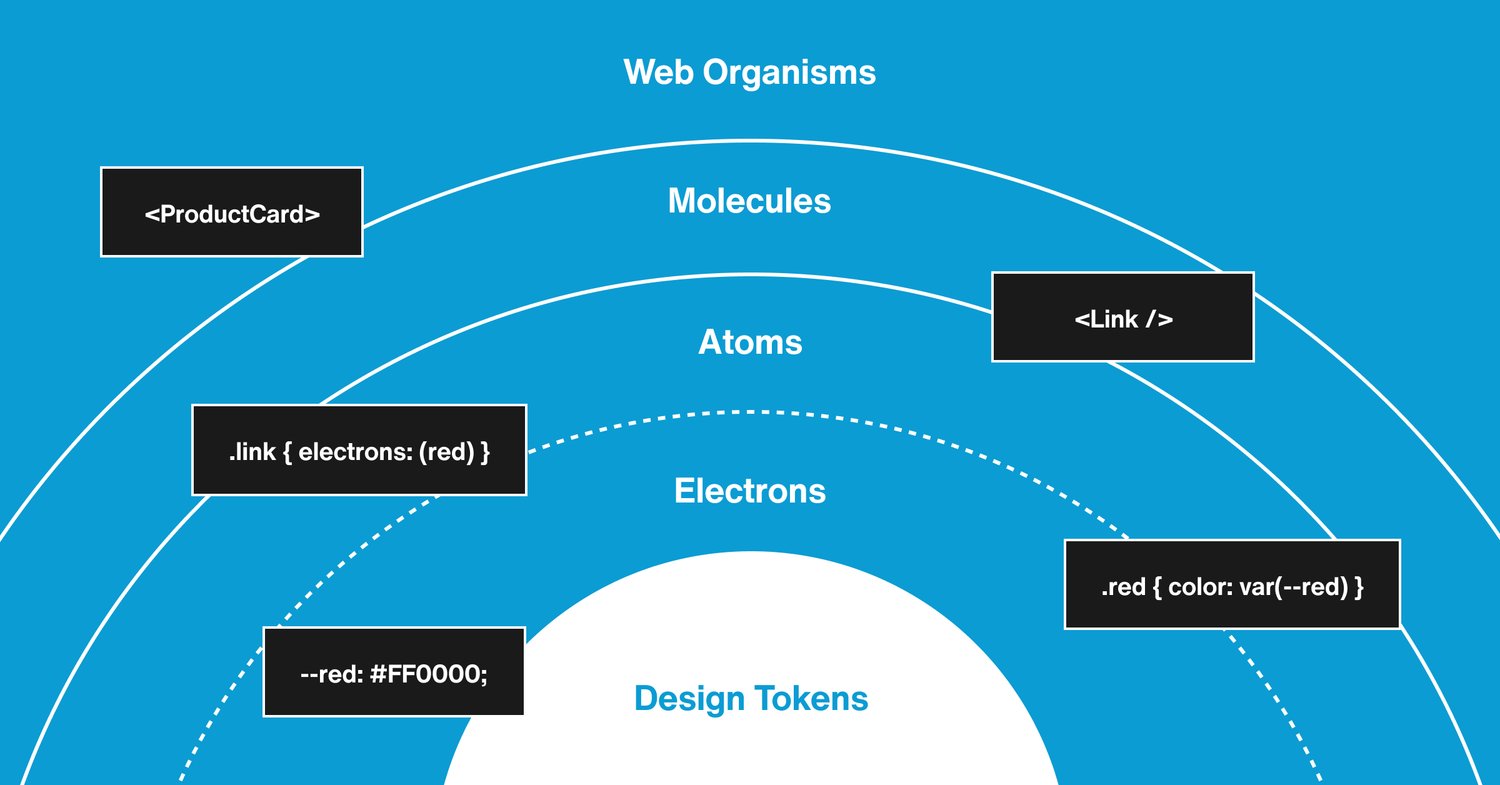
- Design Tokens
- A centralised source of truth for variables and assets that define the core of the Design System. Some examples are: colour palette, spacing, typography, fonts, icons, etc.
- Electrons
- A subset of the CSS grammar that only allows properties and values that are consistent with the specifications of the Design System. e.g.
paddingTop_m,fontFamily_sansSerif, etc. - Atoms
- A composition of electrons and/or other atoms that serve a single generic purpose and cannot be divided further without losing its functionality. E.g. the collection of electrons needed to create a button. In our implementation this is the last layer that directly uses CSS.
- Molecules
- A composition of atoms and/or other molecules forming a single generic component. An example could be the React implementation of different button types ready to be used as a package. At this level there should not be any business logic and emphasis is given to reusability and consistency with design specifications. For example, most of these molecules will also be available as components in the shared designer library.
- Organisms
- A composition of molecules, atoms, and/or other organisms to fulfill a specific business use case. They are not part of the core component library and are owned by different teams owning the specific feature they enable.
Consistent with the natural world analogy, elements belonging to the simpler layers like electrons and atoms, tend to be stable and only very rarely receive any updates, for example a major redesign every few years. On the other hand as the complexity of the layer increases, changes happen more and more frequently. Based on this expected behaviour, we shaped our architecture in order to optimise for:
- very frequent changes in organisms
- occasional changes in molecules
- very rare changes in atoms and electrons.
We were also able to use these assumptions as a technical leverage to maximise other dimensions like bundle size, enforced visual consistency, testing, and documentation.
Contributions and Ownership
In terms of tangible entities, the Zalando Design System is composed of different parts with different ownership and contribution processes in place, this article covers the details of our "contribution model" more in-depth. Here, we will focus on the parts affecting the web platform, but a similar structure can be encountered for mobile app development as well.
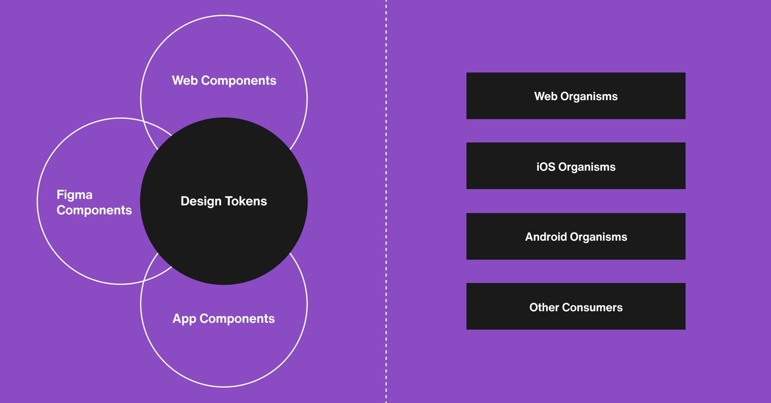
- Design Tokens repository
- Owned by the larger Design System team, including designers as well as web and app engineers.
- Figma component library
- Includes a visual representation of the Design System specifications as well as a centralised component library that can be used by designers in many different teams to create screens and requirements for arbitrary features.
- Web component library
- Structured as a monorepo, it exports a single npm package for each atom, molecule and organism as well as a single highly optimised CSS bundle. The central Design System team has the ownership of the CSS layer, the atoms, the molecules, and some generic organisms.
Using GitHub code owners, different teams own specific organisms and are responsible for maintaining any business logic required. Pull requests on code owned folders are usually faster to approve and merge as we ensure that changes on a code owned component will not affect other exported packages.
The only way to use CSS on organisms and molecules is via atoms, this ensures a certain amount of consistency and makes it easy to spot possible deviations from the Design System specifications. Using a single, predictable CSS bundle and a set of React hooks and patterns, we encourage consistency and composability over one-off implementations. In return we get a very scalable library where an unlimited number of organisms will always result in the same CSS bundle size and not affect each other JS bundle size.
Challenges and Pain Points
Creating a Design System from scratch and driving its adoption in a large company was definitely challenging, from gathering the requirements from many hidden use cases to getting enough traction to refactor complex applications; it has been a journey where communication and coordination have played a major role. Finding a technical solution able to grow and scale as fast as our requirements was also a challenge.
While the system has been running relatively smoothly for more than 2 years and the adoption rate is close to 100%, there are some long-lasting pain points and possible areas for future improvements.
Fragmented Ownerships
Finding the right owner for specific common components like product cards, carousels, banners, etc. is extremely difficult from an organisational point of view. Even when an owner is found, it is hard to prevent some conflicts and overlaps of responsibilities. For example, multiple variations of the same components start to appear with different ownerships, features that require coordination across certain premises need the involvement of different teams, and the discoverability of what is currently available becomes a crucial requirement.
Coupling with Deployments
In software engineering, it is usually considered a best practice to group things that change together. Currently, a new version of the component library and a new version of the live customer-facing application are handled by different pipelines and the codebases live in different repositories. Although having independent releases and a platform-agnostic pipeline may be convenient, we cannot ignore the reality of having one main consumer. In this case, a solution involving a larger monorepo may help with the bottleneck problem created by the need to keep versions in sync.
Conclusions
A Design System tends to behave like most complex systems. Different layers evolve and stabilize at different paces, with a slow-changing core and fast iterations on the edges. The biology metaphor fits quite well in those behaviors and got popularized with atomic design. Porting those complexity layers into a technical implementation was not always straightforward, but overall a good decision.
Code can be observed with the same curiosity we have when looking at nature. Identifying the boundaries between different layers and their relationships is the key to control the complexity involved. While, to some extent, exceptions will always exist, knowing what parts of the system are stable, which ones are changing fast, and how they affect each other is a powerful tool. The architecture and processes around a Design System can be shaped around these characteristics in order to optimize for fast iterations on the edge layers and stability on the core ones. Embracing the chaotic nature of changes while learning and observing the larger patterns at play is the key to achieving long-term stability and a healthy evolution process.


