We, Mike Morgan and Steve Conway, are a pair of Senior Developers at Scott Logic who have recently been evaluating Business Intelligence tools. Our focus has been on tools for use on cloud platforms, with moderate levels of demand. We were particularly interested in how easy they were for novice BI users (like ourselves) to get to grips with.
In this blog we will look at three of the leading tools, Microsoft Power BI, Amazon Quicksight and Tableau. We will discuss some of our findings and impressions and give you a feel for when we think each tool could be useful by looking at user experience, feature richness, integrations, scalability and available statistical functions.
User Experience
Power BI is a platform commonly used by Business Analysts (read here), but designed to be used by anyone. As such, it tries to be very intuitive - hiding the technical details from the user and presenting a drag-n-drop style interface. There is a preferred workflow to guide a user through the steps of data preparation, analysis and visualisation but this workflow is not mandatory. An experienced user is free to work in whatever fashion suits them.
Users will typically access the platform via the desktop application Power BI Desktop. Assets created using this tool can be shared with other users via an on-line service (Power BI Service), or on-premise service (Power BI Reporting Server). This really is a platform intentionally designed so that non-technical users can create reports, manipulate data, and perform in-depth data analysis operations.
QuickSight provides rapid deployment, especially for organisations already within the AWS ecosystem. A drag-n-drop interface provides an intuitive method of building visualisations, provided the built-in charts meet your requirements. Adding custom charts is not supported, beyond embedding external resources. We found that Quicksight is extremely easy for non-technical users to use, but currently lacks support for more powerful analyses and reports.
Tableau is a platform of services and prides itself on being a market leader in business intelligence (article). Users will typically access the platform via the desktop application Tableau Desktop. Though Tableau is typically quoted as being popular due to its ease of use, it is widely believed to have the longest learning curve of all the tools in this genre. Like Power BI, there is a recommended workflow but this is not mandatory. It’s possible to produce no-code visualisations, but users with technical know-how can extend the capabilities of the tool beyond the out-of-the-box features.
Feature Richness
Based on the tools we looked at, Power BI has the most functionality built into the product (see Quick Comparison below). There are a staggering number of functions available and this renders the need for third-party compute integration unnecessary in many cases. The number of visualisations available is also the largest of the popular BI analysis tools, including GIS visualisations and integration with the largest GIS service provider ArcGIS.
In QuickSight, building basic visualisations is very straightforward, but more advanced analytics are lacking at present. It is not possible to add custom visualisation components, beyond embedding external visual content (typically using embeddable URLs). We expect that more features will be added over time. Within the Amazon AWS environment, more complex analyses can be carried out in Amazon Athena, using Apache Spark and Athena Notebooks.
Historically, Tableau was known for easy data visualisation. It’s very easy to get a ‘recommended’ visualisation of data based on user selected fields. A decent array of options are available but it has been remarked (on many occasions) that doing anything non-standard requires a lot of ‘hacky workarounds’ to achieve. In fairness, this is also due to an increasing need for advanced story-telling and analysis by business analysts, which Tableau does not yet have an ‘easy’ solution for.
Integrations
Power BI has a great many data connectors, with wide coverage of Azure services as well as many other data sources and Saas services.
QuickSight integrates seamlessly with AWS services and a number of third-party tools often used in AWS, such as Apache Spark. However, it has fewer integrations with tools outside the AWS ecosystem and very limited support for third-party Saas services.
Tableau has the greatest number of connectors for data sources, covering many databases, cloud services and Saas services such as SAP and Salesforce.
Scalability
As your organisation grows, the volume and complexity of your data will inevitably increase. Here’s how each BI tool tackles scalability:
-
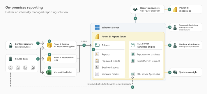
Power BI: has multiple server offerings. Scaling for Reporting Server, is done on-premise and can be horizontally scaled by adding more services on hardware. The typical architecture is as follows:
 (source)
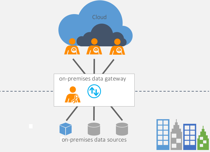
Easier user scaling can be achieved using Data Gateway. The data gateway acts as a bridge to provide quick and secure data transfer between on-premises data (data that isn’t in the cloud) and several Microsoft cloud services. These cloud services include Power BI, PowerApps, Power Automate, Azure Analysis Services, and Azure Logic Apps. By using a gateway, organisations can keep databases and other data sources on their on-premises networks, yet securely use that on-premises data in cloud services.
 (source)
The Microsoft Power BI service is the Software as a Service (SaaS) part of Power BI. The Power BI service lets you consume and interact with reports, as well as individual visual elements found in those reports, right from your browser. Scaling is taken care of by the service in conjunction with MS Fabric / Azure services by one or more users with the following roles:
- Power BI Administrator
- Power Power Platform Administrator
- Office 365 Global Administrator
-
QuickSight: Leverages the inherent scalability of AWS. It automatically scales compute resources based on usage, with no user actions required. It supports up to a billion rows per dataset and tens of thousands of users. This makes it a strong choice for organisations with unpredictable data volumes.
-
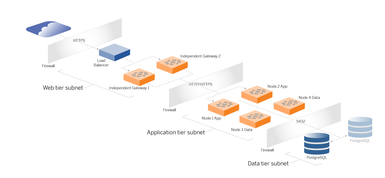
Tableau: As a service, Tableau server can be scaled on-premise or in a cloud vpc. A recommended architecture is as shown:
 (source)
It consists of a tiered topology where each layer of server application functionality (web gateway tier, application tier, and data tier) is bound and protected by access-controlled subnets. Users accessing the server application from the internet are authenticated at the web tier. Once authenticated, the request is proxied to a protected subnet where the application tier handles the business logic. High-value data is protected by the third subnet: the data tier. Services in the application tier communicate over the protected network to the data tier to service data requests to the backend data sources.
An easier option is to take advantage of Tableau Public - an online service that offers ‘free’, publishing to Tableau users. This works well for publicly viewable content, but for content that is targeted at enterprise-only audiences, Tableau Cloud exists to make it easier to scale according to need.
Statistical Functionality
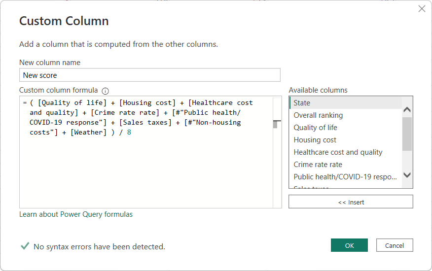
Of the BI tools discussed here, Power BI has the richest set of statistical functions, catering to both basic and advanced analytical needs. This is good because, unlike Tableau, it has minimal integration options. That said, the C# SDK is a very powerful integration option. The full list of Power BI functions can be found here. Typically, users apply functions by invoking pop-up menus or creating calculated fields. Created fields allow a user to build code statements by clicking on the appropriate fields and observing the final result in a side window (as shown below).
 (source)
Unlike Tableau, Power BI encourages the use of code especially when performing analysis. They have a feature-set called DAX (Data Analysis Expressions) which will look very familiar to those comfortable with SQL.
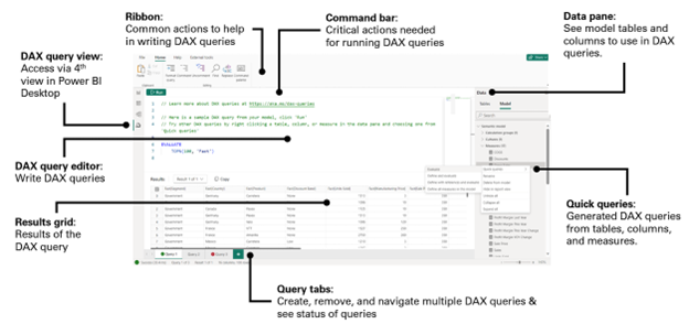 (source)
QuickSight provides basic statistical functions. However, it is missing built-in functions for some common statistical measures and statistical tests, regression analysis and clustering, requiring the user to code these as needed. More powerful analysis can be carried out by using Apache Spark within Amazon Athena, with QuickSight displaying the final reports.
As Tableau prioritises visualisation, it offers only a modest selection of statistical functions for exploratory analysis. For advanced statistical analysis, a user is required to integrate with external libraries / frameworks such as R, Python and MATLAB. It does have an impressive array of integration options but this may present an additional barrier of entry for some users. Considering how mouse-driven the Tableau interface is, these integration options may be beyond capabilities of the average Tableau user. Each of them provide a code-based approach to extending the base functionality. Typically, users apply functions by invoking pop-up menus, or dragging a field to the appropriate area of the workspace surface. Calculated fields offer another ‘no-code’ way to perform calculations. The user builds code statements by clicking on the appropriate fields and observing the final result in a side window (as shown below).
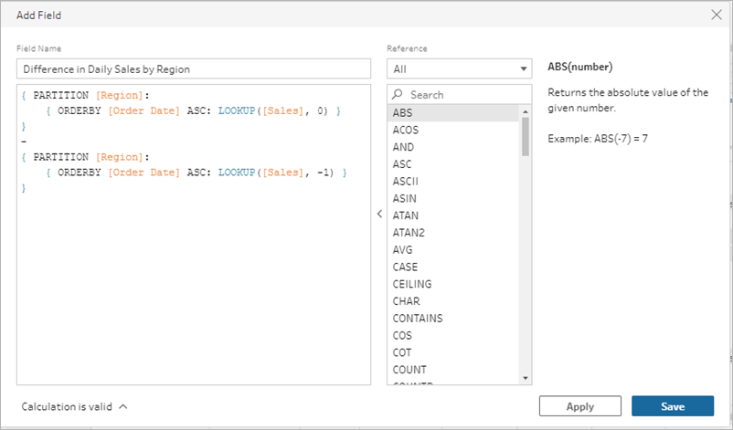 (source)
Selecting the Best Fit
The optimal BI tool hinges on your specific needs. Power BI reigns supreme in Microsoft-centric environments or when advanced analytics and customization are paramount. Powerful though it is, it does leave one feeling that a total ‘buy in’ to the MS platform is required to use in an enterprise set-up. It has a very impressive list of data source connectors and is very user-friendly, from a BI point of view. However, the experience of user-management and deployment may prove less enjoyable (more detail here).
QuickSight is a strong choice for organisations heavily invested in AWS and seeking a fast, user-friendly, and highly scalable BI solution. It makes creating common visualisations easy, but for heavy-weight analyses and data exploration, combining Quicksight with Amazon Athena and Apache Spark may be necessary.
Tableau takes the crown for crafting stunning and insightful data visualisations, especially for users with limited technical backgrounds. It also offers integration with common data science tools such as R and Python. After using the Desktop tool for a short while, I was left feeling that I could probably achieve quite a lot with it, but it might be an awkward journey getting there - at least until one becomes very familiar with it. For example, In addition to thinking about the data types of data source fields, a user must also consider if they should be ‘measures’ or a ‘dimensions’. These colour-coded classifications have implications on how the field can be used when creating visualisations. These classifications help Tableau suggest the appropriate visualisation for you, but can make it difficult when you want to do something a little more specialised or advanced (more detail here).
Quick Comparison
| Power BI | QuickSight | Tableau | |
|---|---|---|---|
| Supported Platforms | Windows | AWS | Linux, Windows |
| Automation | Power BI REST API for programmatic resource management | Resources can be managed using CloudFormation, CDK, Terraform or an SDK provided in several languages. | Tableau Server REST API for programmatic resource management |
| Features - Data Prep |
Row and column filtering Data Type assignment Combine data sources Calculated fields |
Row and column filtering Data Type assignment Combine data sources Calculated fields |
Row and column filtering Data Type assignment Combine data sources Calculated fields |
| Features - Analysis | Analysis is performed via visualisation. Tables and a variety of charts and graphs exist to help explore and explain data. |
Easy to use but limited capability . Combine with Amazon Athena and Apache Spark for more powerful capabilities. |
Analysis is performed via visualisation. Tables and a variety of charts and graphs exist to help explore and explain data. |
| Features - Visuals |
30+ charts and visuals available for use out of the box. |
20+ charts and visuals available for use out of the box. |
20+ charts and visuals available for use out of the box. |
| Extensibility |
.Net SDK (can embed reports into web pages with JS / Typescript SDK) |
Very limited. |
Hyper API - for file manipulation. Connect SDK - for ODBC and JDBC connections. Extensions - for interoperability with Matlab and Python. SDK - for programmatic development using Python or R. |
| Impressions & User Reviews |
I found Power BI Desktop to be very intuitive. The GUI is nicely presented, and the interface is driven by drag-n-drop operations, rather than code. I was able to ‘guess’ how I might produce my first visualisation and it worked as expected. Working through the study material only helped me appreciate how much more it could do. The weakest point for me was S3 connectivity. It can use S3 as a public data source, but does not offer a credentials-based approach to connecting S3 data sources. Other than that, I found this to be a very capable, and user-friendly tool. Other users had this to say on Gartner: |
I found Amazon QuickSight incredibly easy to get going with. The importing of data and creation of charts was an extremely smooth experience with an intuitive UI. Other users had this to say on Gartner: |
I found Tableau Desktop to be less intuitive than Power BI. The GUI is nicely presented, and the interface is driven by drag-n-drop operations, rather than code. However, this did not help make the tool easy to understand. I had to do a short course of study before feeling comfortable producing something intentional. I now understand this to be due to Tableau trying to be ‘helpful’, in the sense that it will try to offer the most sensible analysis visualisation based on field selection. Other users had this to say on Gartner: |
| Pricing |
Desktop
Report Server
Power BI
Microsoft Fabric
|
Author
Author
Author with QuickSight Q
Reader
Reader
Reader with QuickSight Q
Capacity pricing
SPICE
$0.38 per GB / mo
|
For Individuals
Tableau Creator
For Teams / Organisations
Tableau Creator
Tableau Explorer
Tableau Viewer
Pricing for both can be found here. |
Additional Considerations
Remember, our analysis focuses on core functionalities. Security, pricing models, and the specific needs of your organisation are additional factors to consider before making your final decision.
Final Thoughts
If you work on a Windows machine Power BI would seem to be the natural choice. The desktop client is free, and it boasts an impressive number of features out of the box. It is backed by one of the tech giants so it will be supported for some time to come. Integration with platforms like Azure and MS Fabric means users can deploy to the cloud on ever-expanding platforms (read more here).
Tableau appears to remain a solid choice, in that it has been around a long time (started in 2003, v1 was published in 2005 - read more here) and hosts a good set of on-premise and cloud deployment options. Although more expensive than Power BI, some still regard it as the better choice.
If you work mainly in the AWS cloud and don’t require advanced features, then Amazon QuickSight is easy to get going with. More advanced features may require adding Amazon Athena.
Further Exploration
For an in-depth Power BI vs. QuickSight comparison, explore “Power BI vs Amazon QuickSight: A Gartner Peer Insights Review”.
To learn more about Tableau vs. QuickSight, check out “Tableau vs AWS Quicksight”.
By understanding these key differentiators, you’ll be well-equipped to select the cloud BI tool suited to your organisation’s specific requirements.


