A heatmap chart is a visual representation of data presented in a matrix format. It uses different colors to represent the magnitude of values, making it easy to identify patterns and trends within complex datasets. Warm colors depict higher values, while cooler colors indicate lower ones. This type of chart finds application in diverse fields such as data analysis, biology, finance, and web analytics, offering an efficient means to detect significant data points and correlations without extensive numerical examination.
In this blog, we will cover:
- What is a Heatmap Chart?
- Why Heatmap Charts?
- Hands-On
- Conclusion
What is a Heatmap Chart?
A heatmap chart is a graphical representation of data that uses colors to represent individual values on a two-dimensional matrix. It is particularly useful for visualizing the distribution and density of data points in a dataset. Heatmap charts are commonly used to display data in a way that makes patterns, trends, and correlations more easily recognizable.
In a heatmap chart:
- X-axis and Y-axis: The horizontal and vertical axes represent categories or dimensions of the data being analyzed.
- Color Mapping: Each cell in the matrix is assigned a color based on the value it represents. The colors typically range from cool to warm colors (e.g., blue to red), with variations in between representing different levels of the data.
- Intensity: The color intensity or shade of each cell indicates the magnitude of the value it represents. Darker colors indicate higher values and lighter colors indicate lower values.
Heatmap charts are versatile and can be used for various purposes, such as:
- Data Density: They can show where data points are more concentrated, helping to identify patterns and clusters.
- Correlation Analysis: Heatmaps can reveal relationships between different variables by displaying how they change together.
- Time Series Analysis: Heatmaps can be used to visualize changes in data over time, with colors showing the intensity of change.
- Geospatial Analysis: In geographical contexts, heatmaps can represent data over a map, indicating hotspots or areas of interest.
- User Behavior Analysis: Heatmaps are used in web analytics to show where users are clicking, scrolling, or interacting the most on a website.
Why Heatmap Charts?
Heatmap charts are important because they offer an accessible and powerful means of analyzing and interpreting intricate datasets, enabling researchers and analysts to make informed decisions and observations efficiently.
Hands-On

Required installations for the process
- Syncfusion Heatmap: This package is used to plot a graphical representation of 2-dimensional data for users to be able to easily analyze huge chunks of data and get the required information.
In this hands-on, we will begin with an online compiler for angular called StackBlitz that gives us the flexibility of an already created folder structure. We will be using this compiler to create flexibility for users to plot a heatmap.
We will first begin with exploring the files created by default and then alter the folder structure as per our need. To create a new HTML file, we will alter the input parameter value and change the template URL to point to the newly created HTML file for the child component. We will import the heatmaps component into the app module file.
Post that, we will install the syncfusion heatmap package to be able to plot heatmaps. Adding the required imports (components, services, modules), we will then alter the HTML file to see if the heatmap space is plotted and if the package installation worked successfully.
Post that, we will declare the data sources and the axis labels and then bind the same in the HTML file to view the heatmap. Finally, we will explore the plotted heatmap with and without the axis and look at the labels it plots.
To perform the hands-on on a local machine, you can follow the steps mentioned in the below link of the original angular documentation to create a new project and then follow the hands-on steps shown below.
https://angular.io/tutorial/toh-pt0
To follow the steps we performed, you can navigate to this link. This link is an online compiler for angular and can be used to code logic, test out features, create simple applications, and much more.
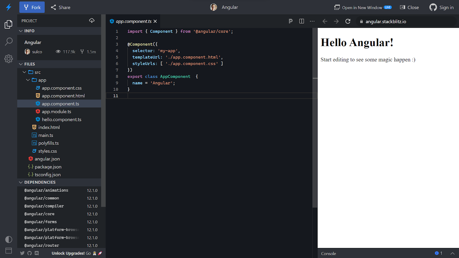
Once you click on the above link, you will be navigated to an online compiler as shown in the image below. This is the default layout that is created for us. Stackblitz even allows us to link our projects to the GitHub repository which makes it easy for us to keep a record. The below file is in the main component typescript file.
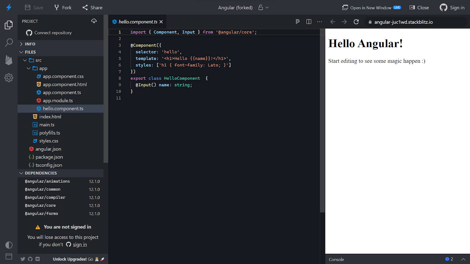
A default file is created with the name hello.component.ts which takes input for the name from the app.component.ts file as shown in the image below using the Input decorator.
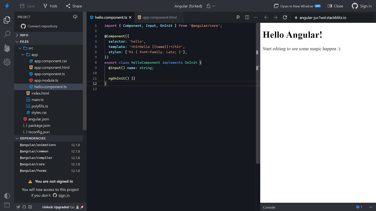
We need to add a ngOnInit() lifecycle so we will extend the class to OnInit and add the lifecycle inside the class.
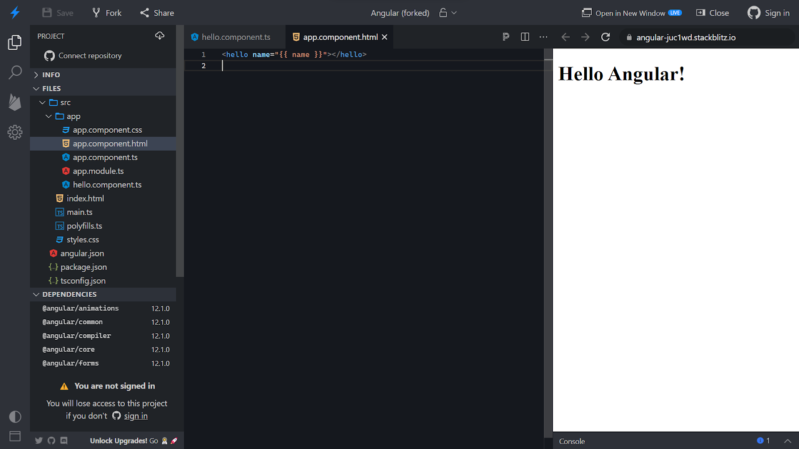
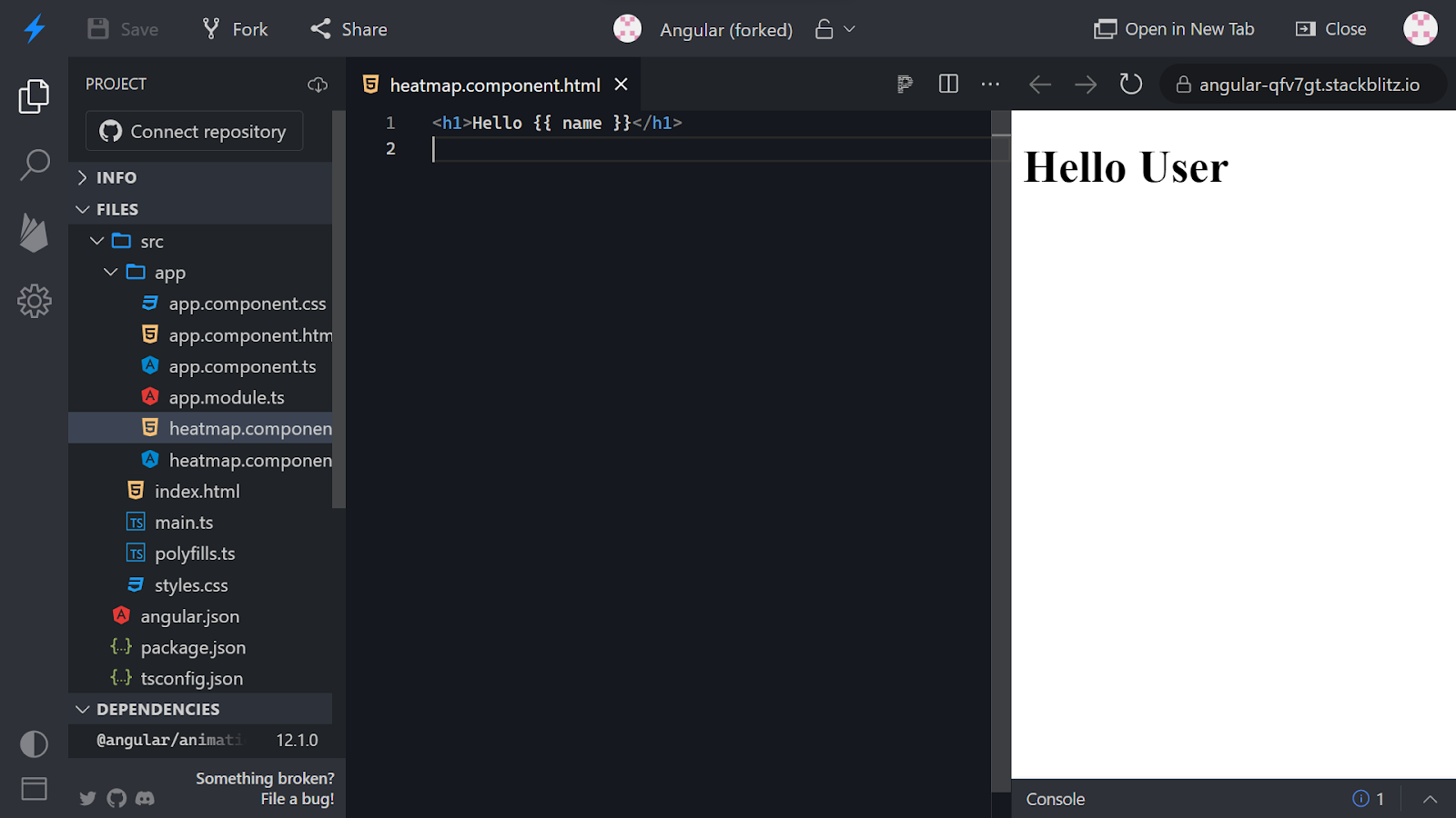
Navigate to the app.component.html file and delete the unwanted part of the HTML page.
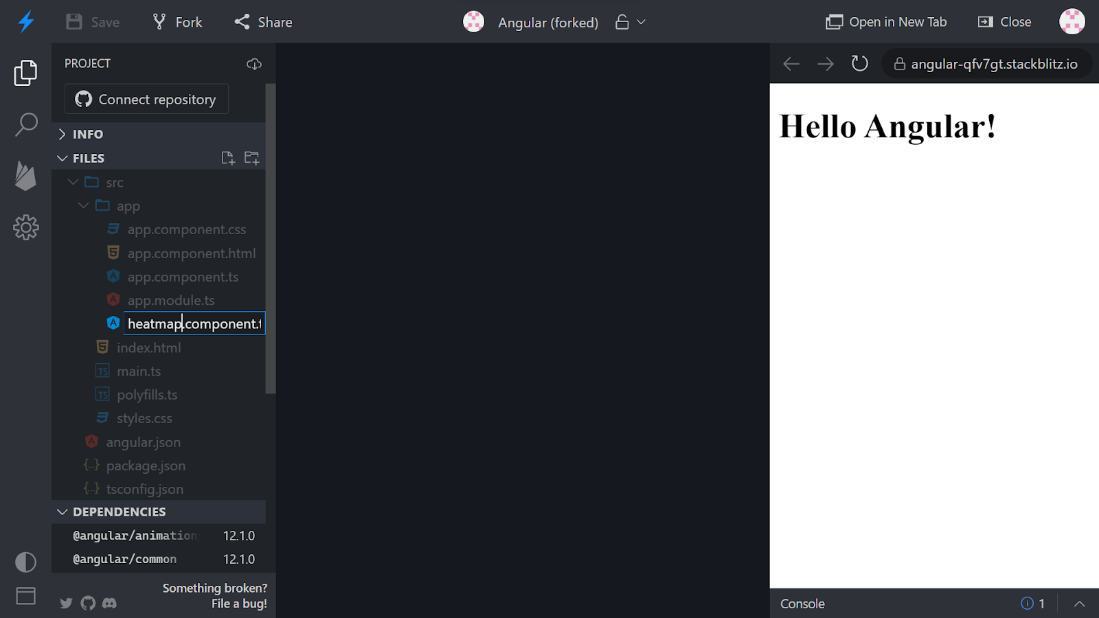
Rename the hello.component.ts file.

Change it to the filename as shown in the image below.
You might see some errors in the preview once you do that. Open the heatmap.component.ts file.

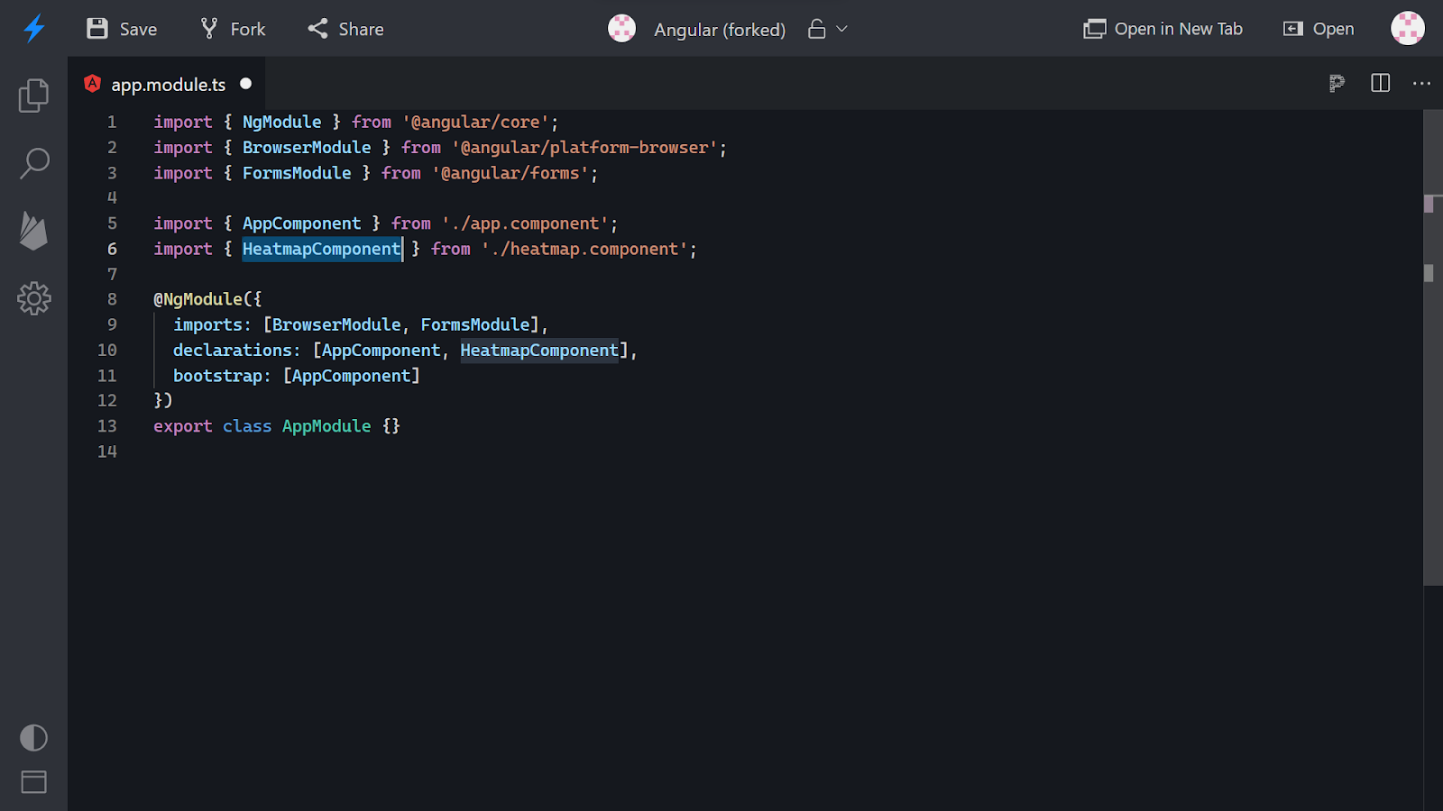
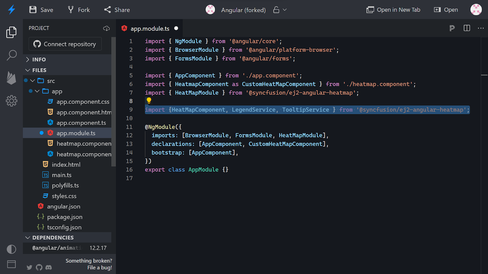
Go to the app.module.ts file and over here we need to replace the import of the hello component with the heatmap component.

Replace the hello component with the heatmap component as shown in the image below and add the same in the declarations as well.
Now, navigate to the heatmap.component.ts file.

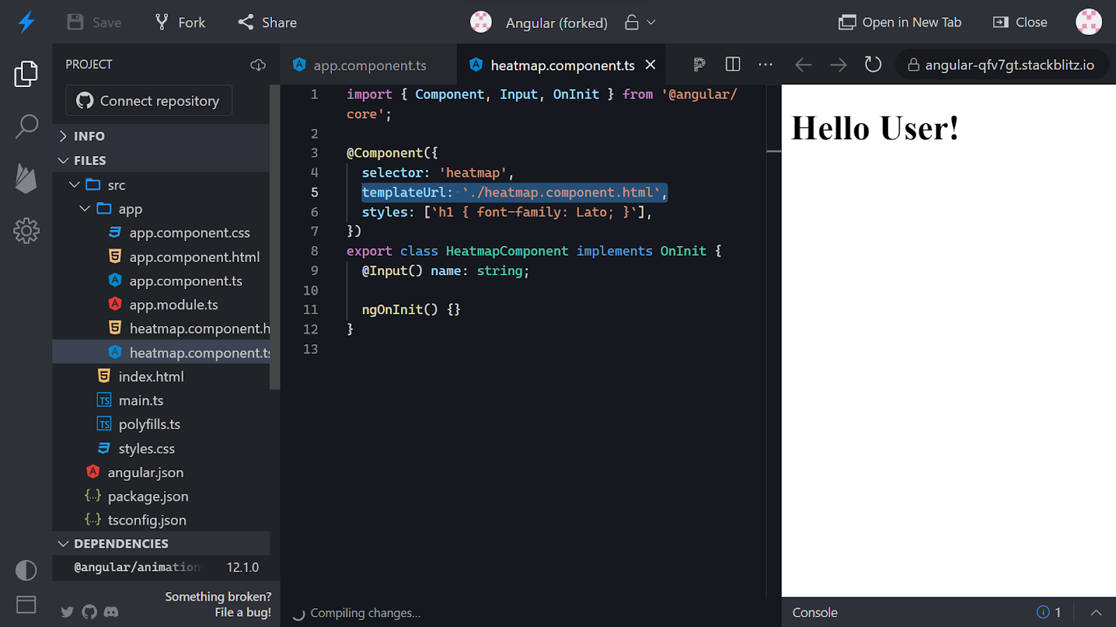
Replace the selector as well as the export class name as shown in the image below.

Navigate to the app.component.html file and change the selector to access the heatmap component.

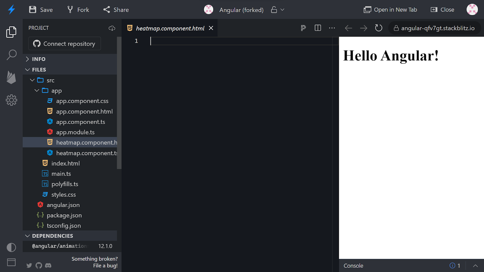
In the left navigation pane, create a new file with the name heatmap.component.html.
In case you wish to change the name input parameter on the HTML page, open the app.component.ts file and change the value of the name variable. You will see the same reflected on the HTML page.

Open the heatmap.component.ts file and change the template key-value pair to templateUrl as the key and the value targeting the newly created HTML file.
Navigate to the heatmap.component.html file and add the below content and you will see the same reflected on the UI.
Now, we need to install the heatmap package. To do so, under the dependencies section, enter the package name below and hit enter. The package will be installed.
@syncfusion/ej2-angular-heatmap

On successful installation, you will see the message as shown below.

Open the package.json file and cross-verify the heatmap package installation.

Close the UI preview to enlarge the code space.

Navigate to the app.module.ts file. Import the HeatMapModule and add it to the imports as shown below.

Navigate to the heatmap.component.html file, remove the existing code, and add the following.

Go to the app.component.html file and call the heatmap component using the selector.

Now, open the preview and on success, you will see the screen as shown in the image below.

To be able to distinguish between the heatmap component from the heatmap module and the heatmap component that we created, we will rename that component that we created as customheatmap component.

Change the name of the component in the declarations array as well.

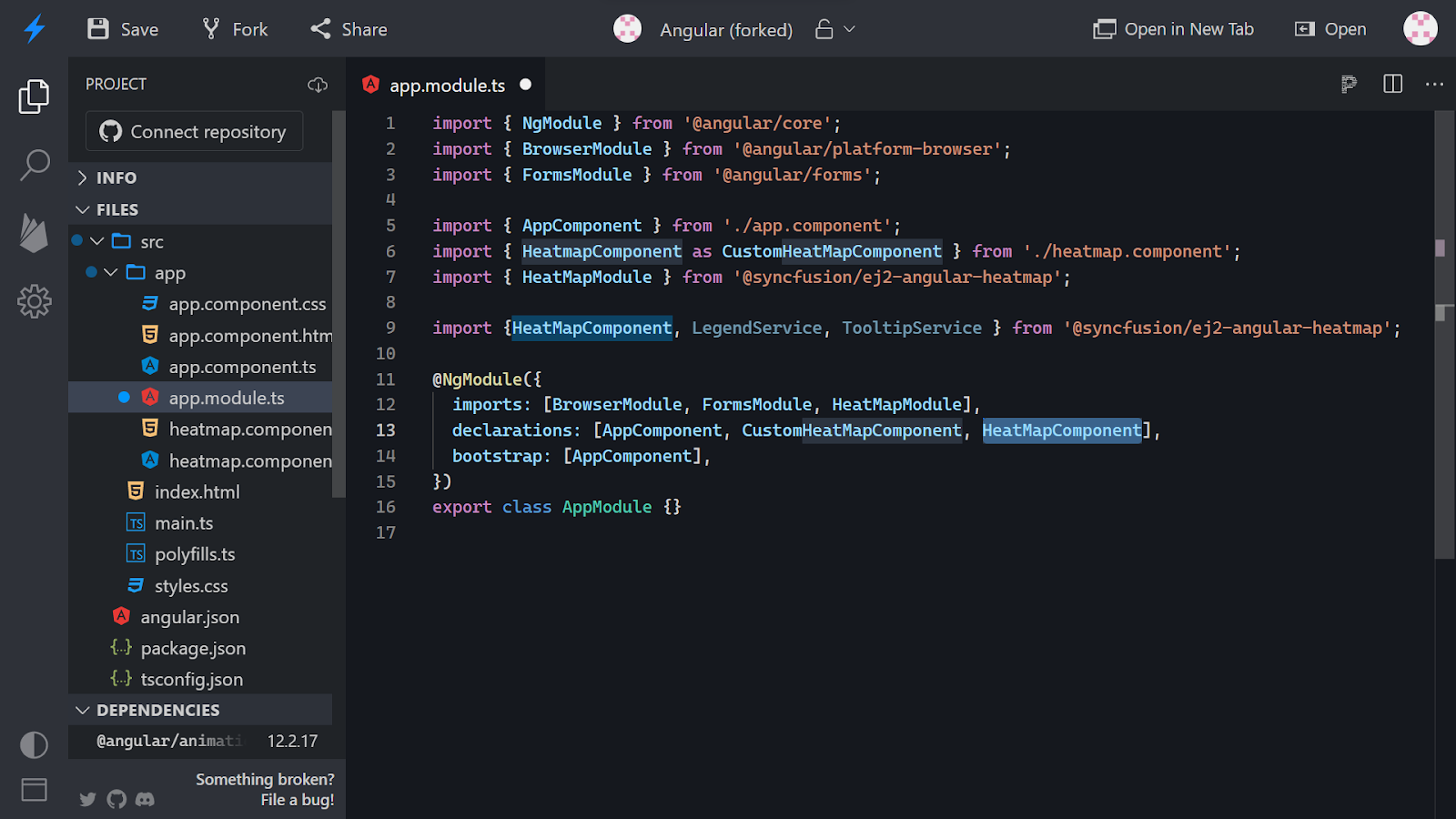
Now, import the Heatmap component, legend service, and the tooltip service from the installed heatmap package.
Declare the heatmap component in the declarations array.
Create a new key of providers and add the 2 services in the provider’s array.

Now, navigate to the heatmap.component.ts file and create a new array.

In ngoninit, declare the values that are to be plotted on the heatmap.

Now, initialize a new variable for the x-axis and add a labels key with the values as names for users.
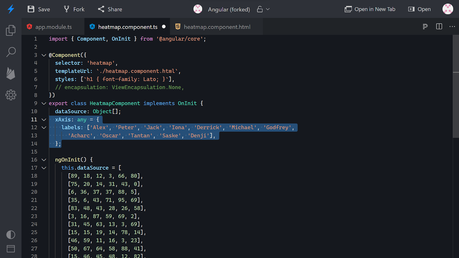
Repeat the same process with the y-axis variable with values as weekdays.

Navigate to the heatmap.component.html file and bind the data source variable as shown in the image below to be able to plot a heatmap with the declared data.

Once done, open the UI in another tab and you will see the plotted heatmap with the data that we declared in the datasource array.

On hovering over the heatmap, you’ll get to see the labels (x and y axis) for each value as shown in the image below.

Now, navigate to the heatmap.component.html and add the bindings for xAxis and yAxis.

Refresh the UI and you’ll see the xAxis and yAxis values as defined by you in the component.ts file.

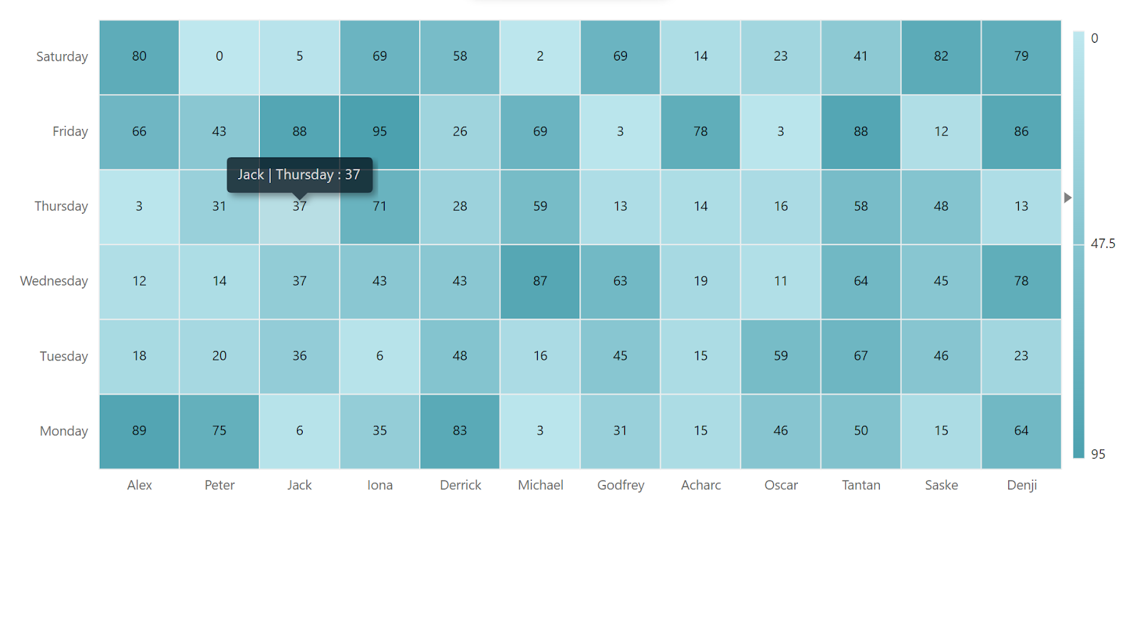
If you hover over any of the boxes, you’ll get to see the label with the x and y-axis tags and the value for the same.
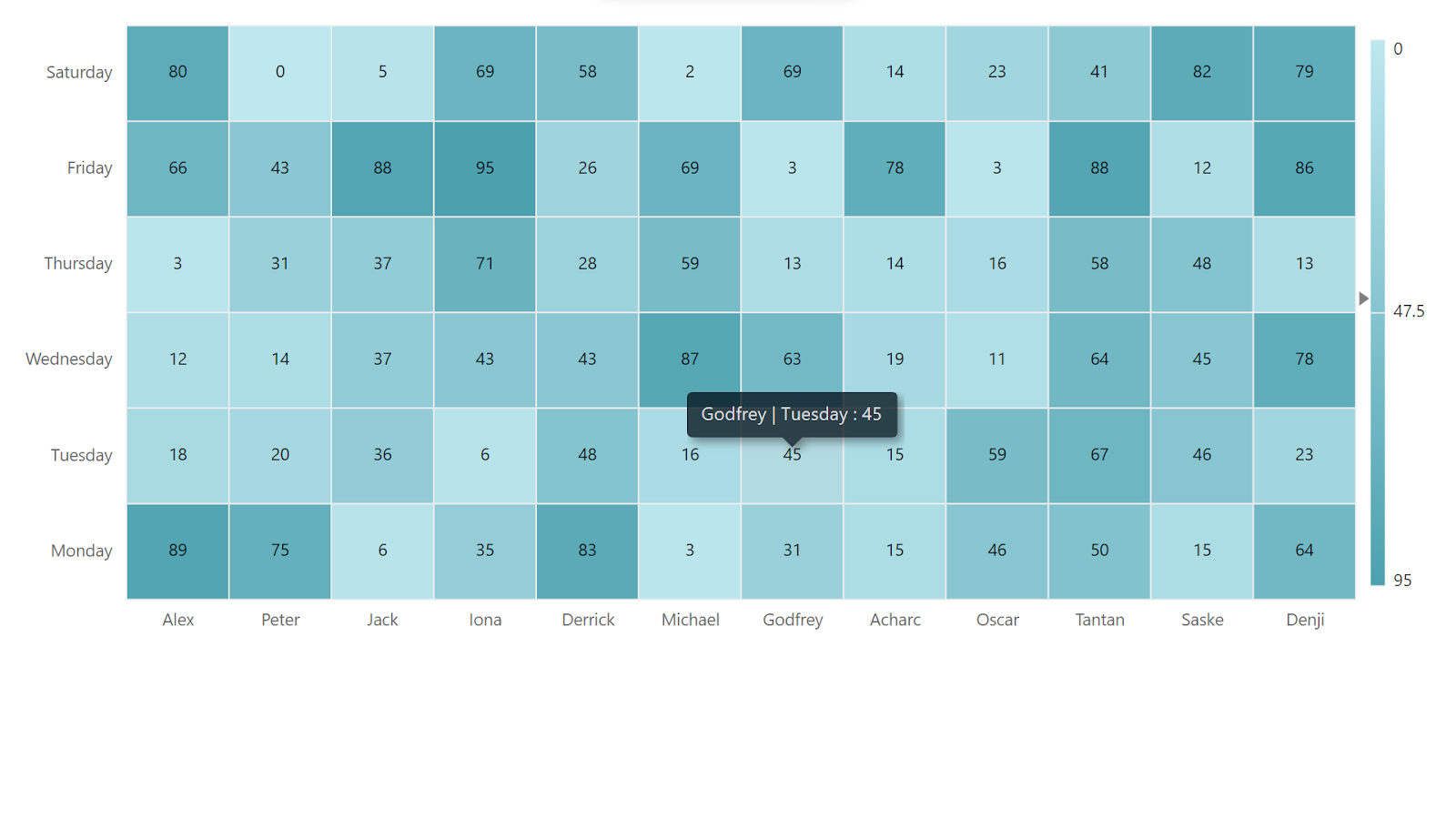
Similarly, if we hover over some other box, it will show the label of that accordingly. The color of the boxes is based on the values used.
Conclusion
In this hands-on, we began with an online compiler for angular called StackBlitz which gives us the flexibility of an already created folder structure. We used this compiler to create flexibility for users to plot a heatmap. We first began with exploring the files created by default and then altered the folder structure as per our need.
Creating a new HTML file, we altered the input parameter value and change the template URL to point to the newly created HTML file for the child component. We then imported the heatmaps component into the app module file. After that, we installed the syncfusion heatmap package to be able to plot heatmaps.
Adding the required imports (components, services, modules), we then altered the HTML file to see if the heatmap space was plotted and if the package installation worked successfully. Then, we declared the data sources and the axis labels and then bound the same in the HTML file to view the heatmap.
Finally, we explored the plotted heatmap with and without the axis and looked at the labels it plots. We will come up with more such use cases in our upcoming blogs.
Meanwhile…
If you are an aspiring Angular developer and want to explore more about the above topics, here are a few of our blogs for your reference:
- How to Handle Authentication in Angular SPAs?
- How to Use NgRx Store in an Angular 15 Application?
- How to Write Unit Tests for Forms in an Angular 15 Application Using Jasmine?
Stay tuned to get all the updates about our upcoming blogs on the cloud and the latest technologies.
Keep Exploring -> Keep Learning -> Keep Mastering
At Workfall, we strive to provide the best tech and pay opportunities to kickass coders around the world. If you’re looking to work with global clients, build cutting-edge products, and make big bucks doing so, give it a shot at workfall.com/partner today!