Plotly Express for Data Visualization Cheat Sheet
Our latest cheat sheet is a handy reference for Plotly Express, a high-level data visualization library in Python built on top of Plotly.
Express Yourself
Here's the situation: You need visualizations, but you are bored with Matplotlib. You want something high-level, quick and easy, but also something that generates attractive results. You want the option for interactivity as well.
Given the above, there is a good case to be made for Plotly Express. You surely already know Plotly, the low-level interactive visualisation library popular amongst data scientists. But are you familiar with its sibling?
Plotly Express provides more than 30 functions for creating different types of figures. The API for these functions was carefully designed to be as consistent and easy to learn as possible, making it easy to switch from a scatter plot to a bar chart to a histogram to a sunburst chart throughout a data exploration session.
If you want to get started with using Plotly Express to create high-quality visualizations, look no further than our latest cheat sheet.
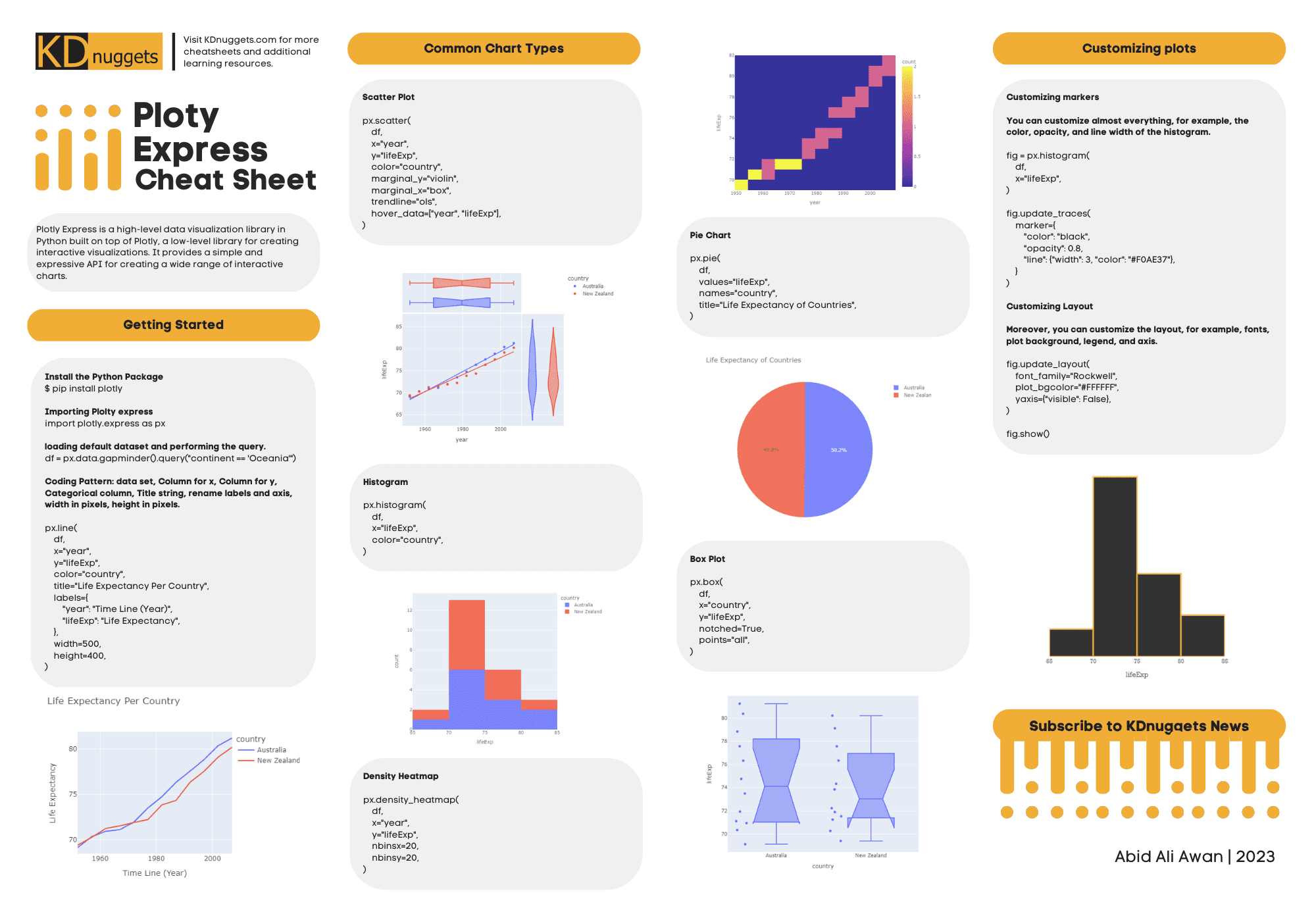
Plotly Express is a high-level data visualization library in Python built on top of Plotly, a low-level library for creating interactive visualizations. It provides a simple and expressive API for creating a wide range of interactive charts.
The cheat sheet first addresses getting started, such as installing the library and its basic syntax. Next, the resources covers creating common chart types with Plotly Express, including:
- Scatter plot
- Histogram
- Density heatmap
- Pie chart
- Box plot
Finally, you will gain some exposure to plot customization, including adjusting markers and layouts.
Don't get stuck using the same boring visualizations to share your discoveries with. Start using Plotly Express and keep out cheat sheet handy for referencing as you learn.
Check it out now, and check back soon for more.