In a 2019 blog I explained how you can make a schematic transit map in ArcGIS Pro. The principles for production remain, but I always had a nagging feeling that the map I made, showing my reimagination of the famous London Underground map, didn’t quite cut it. Time to give it another go!
In May 2022, ahead of the 90th anniversary of Harry Beck’s original London Underground diagram, the new Elizabeth Line was opened. To me, this added more complexity to an already convoluted map. It is congested, with often overly complicated route directions and intersections. The colours no longer make sense with the multiple forms of transit being shown on the same map, and the distinction between them lacked coherence. The uniform line thickness suggests equal service throughout the network which is not the case as frequency of service can vary between 30 trains an hour to 1 train an hour. This is information that could be designed into the map’s graphical language.
So I redesigned my own redesigned map from that earlier blog.

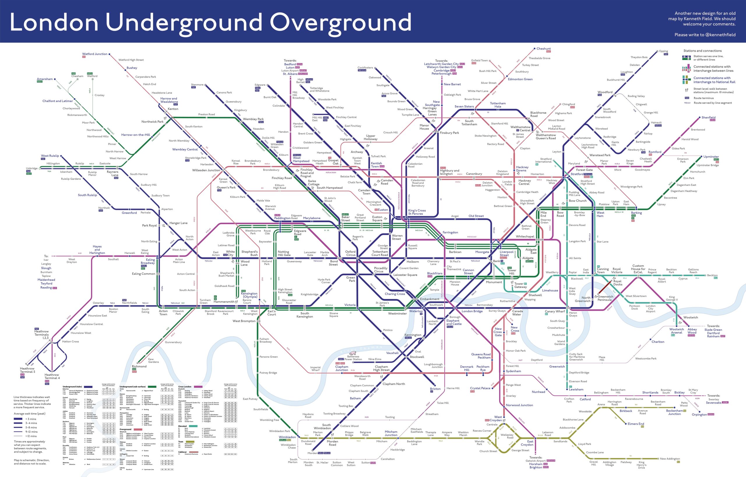
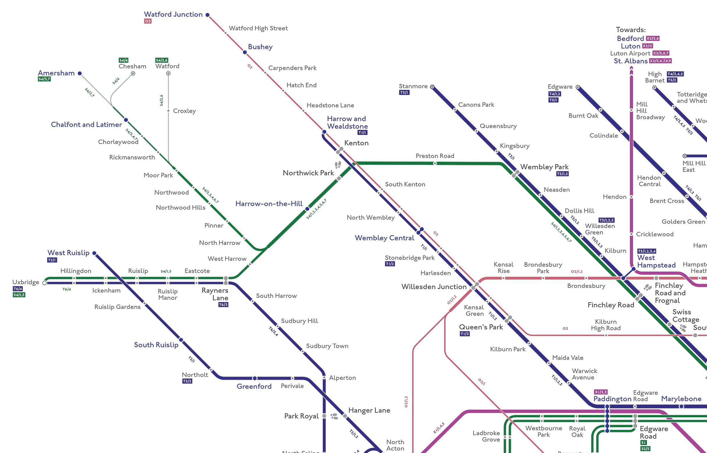
This map demonstrates what a totally redesigned schematic layout might look like that simplifies the organisation of lines, and station intersections. Here’s a small extract from the upper left section of the map (though you’ll need to click on the images, or download the actual map to see the detail)

It uses different font treatments to encode different types of station (such as interchanges, and connections to National Rail services), as well as a redesigned treatment for station symbols. It also demonstrates a new colour scheme for the lines based on mode of transport to replace the randomness of the iconic, though confusing, traditional scheme.
It adds route information alongside lines, and in an accompanying table, because not every route segment on a named line travels the full extent, or even pairs the same origin and destination. And finally, it encodes frequency of service (expressed as average wait time) by scaling the thickness of route segments to give a sense of how long you might have to wait for your service.
It’s both a familiar expression of the famous London Underground map, but makes many changes that bring additional information to the user, using a modern, cleaner, more consistent, and visually accessible schema for those with different colour vision.
You can download the map here. Let me know what you think of it, and whether you find the Easter eggs.
Happy schematic mapping!


Commenting is not enabled for this article.